Org charts are more useful than a list of job titles
What an org chart shows that a staff list hides: span of control, depth, gaps and single points of failure, plus how to build one from a spreadsheet.
The DiagramDock team · · 9 min read
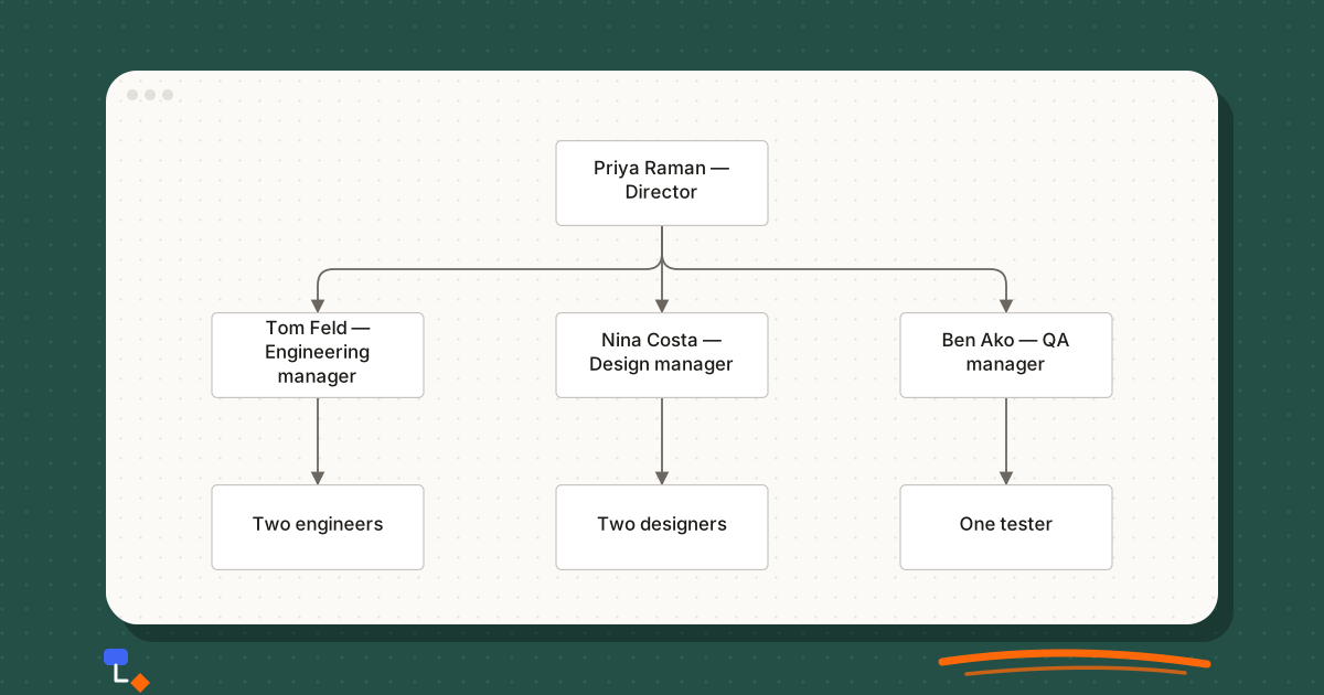
Most companies already have a list of who works there. It lives in the payroll system, the HR spreadsheet or the team page on the website, and it answers one question well: what is this person called? It answers almost nothing else. A list of forty names and titles will not tell you that one manager has eleven reports, that nobody owns customer support, or that a single person is the only route between the finance team and the founder.
An org chart answers those questions because it draws the relationships rather than the people. The boxes matter less than the lines between them. That is why a chart built honestly, from who actually reports to whom, is one of the cheapest diagnostic tools a growing organisation has.
What a chart shows that a list cannot
Put the same forty people into a table and into a tree, and the table will look orderly while the tree looks lopsided. The lopsidedness is the information. Five things become visible once the lines are drawn.
- Span of control. The number of direct reports per manager is the width of each branch. A box with nine children beneath it is a manager whose week is mostly one-to-ones.
- Reporting depth. Count the levels between a new hire and the person at the top. Every level is a place where a decision can wait.
- Gaps. A function the business plainly has, such as invoicing or hiring, with no box anywhere on the chart, is work that someone does informally and nobody owns.
- Single points of failure. One person who is the only connection between two parts of the tree. If they leave or go on holiday, the branch is cut off.
- Dotted lines. People who take priorities from one manager and appraisals from another. Drawn, they show where confusion about authority will come from.
None of these needs analysis software. They need the structure laid out so the eye can compare one branch with another.
%20scale(1.07)%20translate(-260%2C0)%22%3E%3Cline%20x1%3D%22600%22%20y1%3D%2232%22%20x2%3D%22340%22%20y2%3D%22162%22%20stroke%3D%22%236b6660%22%20stroke-width%3D%221.5%22%2F%3E%3Cline%20x1%3D%22600%22%20y1%3D%2232%22%20x2%3D%22600%22%20y2%3D%22162%22%20stroke%3D%22%236b6660%22%20stroke-width%3D%221.5%22%2F%3E%3Cline%20x1%3D%22600%22%20y1%3D%2232%22%20x2%3D%22860%22%20y2%3D%22162%22%20stroke%3D%22%236b6660%22%20stroke-width%3D%221.5%22%2F%3E%3Cline%20x1%3D%22340%22%20y1%3D%22162%22%20x2%3D%22340%22%20y2%3D%22292%22%20stroke%3D%22%236b6660%22%20stroke-width%3D%221.5%22%2F%3E%3Cline%20x1%3D%22600%22%20y1%3D%22162%22%20x2%3D%22600%22%20y2%3D%22292%22%20stroke%3D%22%236b6660%22%20stroke-width%3D%221.5%22%2F%3E%3Cline%20x1%3D%22860%22%20y1%3D%22162%22%20x2%3D%22860%22%20y2%3D%22292%22%20stroke%3D%22%236b6660%22%20stroke-width%3D%221.5%22%2F%3E%3Cg%20transform%3D%22translate(520%2C0)%22%20opacity%3D%221%22%3E%3Crect%20x%3D%220%22%20y%3D%220%22%20width%3D%22160%22%20height%3D%2264%22%20rx%3D%224%22%20fill%3D%22%23ffffff%22%20stroke%3D%22%23c8c4bd%22%20stroke-width%3D%221%22%2F%3E%3C%2Fg%3E%3Cg%20transform%3D%22translate(260%2C130)%22%20opacity%3D%221%22%3E%3Crect%20x%3D%220%22%20y%3D%220%22%20width%3D%22160%22%20height%3D%2264%22%20rx%3D%224%22%20fill%3D%22%23ffffff%22%20stroke%3D%22%23c8c4bd%22%20stroke-width%3D%221%22%2F%3E%3C%2Fg%3E%3Cg%20transform%3D%22translate(520%2C130)%22%20opacity%3D%221%22%3E%3Crect%20x%3D%220%22%20y%3D%220%22%20width%3D%22160%22%20height%3D%2264%22%20rx%3D%224%22%20fill%3D%22%23ffffff%22%20stroke%3D%22%23c8c4bd%22%20stroke-width%3D%221%22%2F%3E%3C%2Fg%3E%3Cg%20transform%3D%22translate(780%2C130)%22%20opacity%3D%221%22%3E%3Crect%20x%3D%220%22%20y%3D%220%22%20width%3D%22160%22%20height%3D%2264%22%20rx%3D%224%22%20fill%3D%22%23ffffff%22%20stroke%3D%22%23c8c4bd%22%20stroke-width%3D%221%22%2F%3E%3C%2Fg%3E%3Cg%20transform%3D%22translate(260%2C260)%22%20opacity%3D%221%22%3E%3Crect%20x%3D%220%22%20y%3D%220%22%20width%3D%22160%22%20height%3D%2264%22%20rx%3D%224%22%20fill%3D%22%23ffffff%22%20stroke%3D%22%23c8c4bd%22%20stroke-width%3D%221%22%2F%3E%3C%2Fg%3E%3Cg%20transform%3D%22translate(520%2C260)%22%20opacity%3D%221%22%3E%3Crect%20x%3D%220%22%20y%3D%220%22%20width%3D%22160%22%20height%3D%2264%22%20rx%3D%224%22%20fill%3D%22%23ffffff%22%20stroke%3D%22%23c8c4bd%22%20stroke-width%3D%221%22%2F%3E%3C%2Fg%3E%3Cg%20transform%3D%22translate(780%2C260)%22%20opacity%3D%221%22%3E%3Crect%20x%3D%220%22%20y%3D%220%22%20width%3D%22160%22%20height%3D%2264%22%20rx%3D%224%22%20fill%3D%22%23ffffff%22%20stroke%3D%22%23c8c4bd%22%20stroke-width%3D%221%22%2F%3E%3C%2Fg%3E%3C%2Fg%3E%3C%2Fsvg%3E)
The department chart above is deliberately small, but the pattern scales. Three managers report to one director, and their teams are uneven: two engineers, two designers, one tester. A list would show seven people. The chart shows that quality assurance is the thinnest branch, and that the QA manager is also likely to be doing hands-on testing whenever the tester is away.
Reading the shape of a chart
Once a chart is drawn, read it the way you would read a map, looking at the overall shape before any single label. A few patterns are worth recognising on sight.
| Shape | What it usually means | Question to ask |
|---|---|---|
| One very wide branch | A manager with far more reports than peers | Is there a natural team lead inside that group already? |
| A long thin chain | Several single-report managers stacked up | Does each level make decisions, or just pass them on? |
| A box with no children and a senior title | A specialist, or a role that has quietly lost its team | Is the title still accurate? |
| Two people reporting to each other's peers | Ownership split across a boundary | Who decides when they disagree? |
| A founder with everyone attached | No management layer yet | Which two or three people would you promote first? |
Single-report chains deserve particular attention. A manager with one direct report is sometimes a genuine apprenticeship arrangement, and sometimes a title given in place of a pay rise. The chart cannot tell you which, but it puts the question in front of the right person.
A useful habit: before sharing a chart, find the widest branch and the deepest branch. If either surprises you, that is the conversation to have first.
Building one from a spreadsheet
Drawing an org chart box by box is fine for eight people and miserable for eighty. The better route is a spreadsheet with one row per person and one column that says who their manager is. That single parent column is all the structure a tree needs.
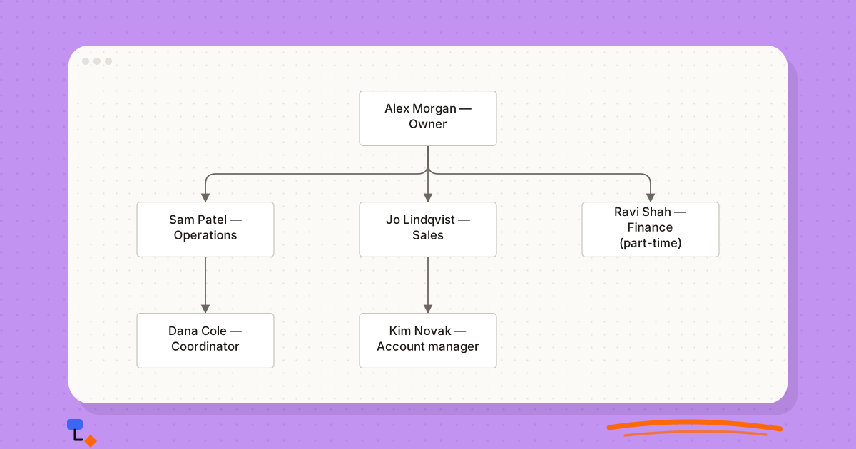
id,name,title,parentId,department
1,Alex Morgan,Owner,,Leadership
2,Sam Patel,Operations lead,1,Operations
3,Jo Lindqvist,Sales lead,1,Sales
4,Ravi Shah,Finance (part-time),1,Finance
5,Dana Cole,Coordinator,2,Operations
6,Kim Novak,Account manager,3,Sales
The rules are short. Every id must be unique. Every parentId must match an id that exists. Exactly one row, the top of the tree, has an empty parentId. And nobody can end up reporting to themselves through a chain, which sounds impossible until a reorganisation is half-entered and A reports to B while B still reports to A.
Those three faults, duplicate ids, missing managers and loops, account for most broken org chart imports. It is worth checking for them before drawing anything, because a tree built on a loop either fails or draws something misleading.
- Use ids, not names, in the parent column. Two people called Sam will happen sooner than you expect.
- Keep titles as people actually use them, not as the contract states them, unless the chart is for HR records.
- Put department in its own column so you can filter or colour by it later, rather than encoding it in the title.
- Leave vacancies in as rows with a name such as "Open role". A planned hire is part of the structure.
Worked example: from 12 people to 40
Take a services business with twelve people. The owner runs it, an operations lead and a sales lead report directly, a part-time finance contractor looks after the books, and everyone else reports to one of the two leads. Drawn, it looks like the small business template below: an owner, three functions, and the first hires under two of them.
%20scale(1.07)%20translate(-260%2C0)%22%3E%3Cline%20x1%3D%22600%22%20y1%3D%2232%22%20x2%3D%22340%22%20y2%3D%22162%22%20stroke%3D%22%236b6660%22%20stroke-width%3D%221.5%22%2F%3E%3Cline%20x1%3D%22600%22%20y1%3D%2232%22%20x2%3D%22600%22%20y2%3D%22162%22%20stroke%3D%22%236b6660%22%20stroke-width%3D%221.5%22%2F%3E%3Cline%20x1%3D%22600%22%20y1%3D%2232%22%20x2%3D%22860%22%20y2%3D%22162%22%20stroke%3D%22%236b6660%22%20stroke-width%3D%221.5%22%2F%3E%3Cline%20x1%3D%22340%22%20y1%3D%22162%22%20x2%3D%22340%22%20y2%3D%22292%22%20stroke%3D%22%236b6660%22%20stroke-width%3D%221.5%22%2F%3E%3Cline%20x1%3D%22600%22%20y1%3D%22162%22%20x2%3D%22600%22%20y2%3D%22292%22%20stroke%3D%22%236b6660%22%20stroke-width%3D%221.5%22%2F%3E%3Cg%20transform%3D%22translate(520%2C0)%22%20opacity%3D%221%22%3E%3Crect%20x%3D%220%22%20y%3D%220%22%20width%3D%22160%22%20height%3D%2264%22%20rx%3D%224%22%20fill%3D%22%23ffffff%22%20stroke%3D%22%23c8c4bd%22%20stroke-width%3D%221%22%2F%3E%3C%2Fg%3E%3Cg%20transform%3D%22translate(260%2C130)%22%20opacity%3D%221%22%3E%3Crect%20x%3D%220%22%20y%3D%220%22%20width%3D%22160%22%20height%3D%2264%22%20rx%3D%224%22%20fill%3D%22%23ffffff%22%20stroke%3D%22%23c8c4bd%22%20stroke-width%3D%221%22%2F%3E%3C%2Fg%3E%3Cg%20transform%3D%22translate(520%2C130)%22%20opacity%3D%221%22%3E%3Crect%20x%3D%220%22%20y%3D%220%22%20width%3D%22160%22%20height%3D%2264%22%20rx%3D%224%22%20fill%3D%22%23ffffff%22%20stroke%3D%22%23c8c4bd%22%20stroke-width%3D%221%22%2F%3E%3C%2Fg%3E%3Cg%20transform%3D%22translate(780%2C130)%22%20opacity%3D%221%22%3E%3Crect%20x%3D%220%22%20y%3D%220%22%20width%3D%22160%22%20height%3D%2264%22%20rx%3D%224%22%20fill%3D%22%23ffffff%22%20stroke%3D%22%23c8c4bd%22%20stroke-width%3D%221%22%2F%3E%3C%2Fg%3E%3Cg%20transform%3D%22translate(260%2C260)%22%20opacity%3D%221%22%3E%3Crect%20x%3D%220%22%20y%3D%220%22%20width%3D%22160%22%20height%3D%2264%22%20rx%3D%224%22%20fill%3D%22%23ffffff%22%20stroke%3D%22%23c8c4bd%22%20stroke-width%3D%221%22%2F%3E%3C%2Fg%3E%3Cg%20transform%3D%22translate(520%2C260)%22%20opacity%3D%221%22%3E%3Crect%20x%3D%220%22%20y%3D%220%22%20width%3D%22160%22%20height%3D%2264%22%20rx%3D%224%22%20fill%3D%22%23ffffff%22%20stroke%3D%22%23c8c4bd%22%20stroke-width%3D%221%22%2F%3E%3C%2Fg%3E%3C%2Fg%3E%3C%2Fsvg%3E)
At twelve, the chart is almost boring, which is the point. The owner has three direct reports. Depth is two levels. The only odd feature is that finance is part-time and external, so nobody inside the company owns cash flow day to day.
Step 1: grow without redrawing
Over eighteen months the company hires. Most new people are added under whoever interviewed them, which is how most small firms grow. The spreadsheet gets rows; nobody looks at the shape. At twenty-five people, someone finally imports the sheet and draws it.
Step 2: read what the chart reveals
The new chart shows three problems at once. The operations lead now has eleven direct reports, because every delivery hire landed there. The sales lead has four. A marketing hire, two support staff and an office manager all report straight to the owner, so the owner's span has grown from three to seven, most of them in functions the owner has no particular expertise in.
There is also a single point of failure that the list never showed. The only person who knows how invoicing works is the coordinator under operations, who also handles supplier payments. Finance, still a part-time contractor, sits on a branch with no children at all.
Step 3: draw the proposed structure next to the current one
Rather than arguing about it in a meeting, copy the chart and edit the copy. In the proposal, operations splits into two delivery teams, each with a team lead promoted from within. Support moves under operations, where its work actually comes from. Marketing joins sales under a new commercial lead. Finance becomes a permanent role, and invoicing moves there from the coordinator.
The owner's span drops back to four. No manager has more than six direct reports. Depth increases from two levels to three for delivery staff, which is a real cost worth naming: a delivery engineer now has a team lead between them and the operations lead.
Step 4: plan the next fifteen hires on the chart
At forty people the company expects to add a second sales team and an HR generalist. Adding them as "Open role" rows in the proposed chart shows where they will land before anyone is recruited. In this case it reveals that the commercial lead would reach nine reports, so the second sales team needs its own lead from the start.
Nothing in this example needed a consultant. It needed someone to draw the actual structure, then a second version, and put both in front of the people affected.
Dotted lines, matrices and honest compromises
Real organisations do not always form a clean tree. A designer may sit in a design team for craft and career, but take daily priorities from a product lead. A school has an academic line and a pastoral line running through the same staff. Agencies have client services and delivery, two hierarchies that must stay connected.
The convention that works is simple. The solid line goes to the person who does the appraisal, sets pay and signs off leave. A dashed line goes to anyone else who directs the work. If more than a handful of dotted lines appear, stop adding them and draw a second chart, one per axis, because a tree crossed by dozens of dashed lines stops being readable.
%20scale(0.77)%20translate(-260%2C0)%22%3E%3Cline%20x1%3D%22600%22%20y1%3D%2232%22%20x2%3D%22340%22%20y2%3D%22162%22%20stroke%3D%22%236b6660%22%20stroke-width%3D%221.5%22%2F%3E%3Cline%20x1%3D%22600%22%20y1%3D%2232%22%20x2%3D%22860%22%20y2%3D%22162%22%20stroke%3D%22%236b6660%22%20stroke-width%3D%221.5%22%2F%3E%3Cline%20x1%3D%22340%22%20y1%3D%22162%22%20x2%3D%22340%22%20y2%3D%22292%22%20stroke%3D%22%236b6660%22%20stroke-width%3D%221.5%22%2F%3E%3Cline%20x1%3D%22340%22%20y1%3D%22162%22%20x2%3D%22600%22%20y2%3D%22292%22%20stroke%3D%22%236b6660%22%20stroke-width%3D%221.5%22%2F%3E%3Cline%20x1%3D%22860%22%20y1%3D%22162%22%20x2%3D%22860%22%20y2%3D%22292%22%20stroke%3D%22%236b6660%22%20stroke-width%3D%221.5%22%2F%3E%3Cline%20x1%3D%22860%22%20y1%3D%22162%22%20x2%3D%221120%22%20y2%3D%22292%22%20stroke%3D%22%236b6660%22%20stroke-width%3D%221.5%22%2F%3E%3Cg%20transform%3D%22translate(520%2C0)%22%20opacity%3D%221%22%3E%3Crect%20x%3D%220%22%20y%3D%220%22%20width%3D%22160%22%20height%3D%2264%22%20rx%3D%224%22%20fill%3D%22%23ffffff%22%20stroke%3D%22%23c8c4bd%22%20stroke-width%3D%221%22%2F%3E%3C%2Fg%3E%3Cg%20transform%3D%22translate(260%2C130)%22%20opacity%3D%221%22%3E%3Crect%20x%3D%220%22%20y%3D%220%22%20width%3D%22160%22%20height%3D%2264%22%20rx%3D%224%22%20fill%3D%22%23ffffff%22%20stroke%3D%22%23c8c4bd%22%20stroke-width%3D%221%22%2F%3E%3C%2Fg%3E%3Cg%20transform%3D%22translate(780%2C130)%22%20opacity%3D%221%22%3E%3Crect%20x%3D%220%22%20y%3D%220%22%20width%3D%22160%22%20height%3D%2264%22%20rx%3D%224%22%20fill%3D%22%23ffffff%22%20stroke%3D%22%23c8c4bd%22%20stroke-width%3D%221%22%2F%3E%3C%2Fg%3E%3Cg%20transform%3D%22translate(260%2C260)%22%20opacity%3D%221%22%3E%3Crect%20x%3D%220%22%20y%3D%220%22%20width%3D%22160%22%20height%3D%2264%22%20rx%3D%224%22%20fill%3D%22%23ffffff%22%20stroke%3D%22%23c8c4bd%22%20stroke-width%3D%221%22%2F%3E%3C%2Fg%3E%3Cg%20transform%3D%22translate(520%2C260)%22%20opacity%3D%221%22%3E%3Crect%20x%3D%220%22%20y%3D%220%22%20width%3D%22160%22%20height%3D%2264%22%20rx%3D%224%22%20fill%3D%22%23ffffff%22%20stroke%3D%22%23c8c4bd%22%20stroke-width%3D%221%22%2F%3E%3C%2Fg%3E%3Cg%20transform%3D%22translate(780%2C260)%22%20opacity%3D%221%22%3E%3Crect%20x%3D%220%22%20y%3D%220%22%20width%3D%22160%22%20height%3D%2264%22%20rx%3D%224%22%20fill%3D%22%23ffffff%22%20stroke%3D%22%23c8c4bd%22%20stroke-width%3D%221%22%2F%3E%3C%2Fg%3E%3Cg%20transform%3D%22translate(1040%2C260)%22%20opacity%3D%221%22%3E%3Crect%20x%3D%220%22%20y%3D%220%22%20width%3D%22160%22%20height%3D%2264%22%20rx%3D%224%22%20fill%3D%22%23ffffff%22%20stroke%3D%22%23c8c4bd%22%20stroke-width%3D%221%22%2F%3E%3C%2Fg%3E%3C%2Fg%3E%3C%2Fsvg%3E)
The agency chart shows why this matters. Account managers and the build team are on different branches, joined only at the managing director. Any coordination between them happens across the tree, informally, and the chart makes that coordination cost visible even before a dotted line is drawn.
Keeping it current
An out-of-date org chart is worse than none, because people act on it. The new joiner emails the wrong manager; the candidate is told the team is larger than it is. Most charts go stale for one reason: updating them is nobody's job.
- Keep the spreadsheet as the source and treat the drawing as an output. Edit the rows, then re-import.
- Attach the update to an event that already happens, such as a starter or leaver form, rather than a calendar reminder.
- Put a date on the chart. A reader can judge a chart dated last month very differently from one with no date at all.
- Keep one current chart and, separately, any proposals. Mixing planned roles into the live chart without marking them causes confusion.
- Review the shape, not just the names, once a quarter. Spans and depth drift quietly as people are added one at a time.
Common mistakes
- Charting titles instead of reporting lines. If the chart follows seniority rather than who manages whom, it will look tidy and be wrong.
- Leaving out part-time staff, contractors or the board. They are part of how decisions get made; mark them differently rather than omitting them.
- Drawing the whole company when the question is about one department. A forty-box chart for a question about three teams buries the answer.
- Using the chart to settle a political question it cannot settle. A chart shows structure; it does not decide who should be promoted.
- Sharing a draft restructure with the whole company by accident. Proposals involving named people need the same care as any HR document.
Doing this in DiagramDock
DiagramDock has an org chart type with its own palette and a CSV import that takes id, name, title, parentId and department columns. Before drawing, it reports duplicate ids, missing managers and loops, so faults in the sheet are caught before they turn into a misleading tree. Automatic layout can arrange the result as a tree, and it only moves things when you ask.
Because diagrams are stored in your browser and never uploaded, a draft restructure stays on your machine. The flip side is that there is no sharing link: export to PDF, PNG or SVG when the chart is ready for others, and keep a workspace backup so clearing browser data does not take the drafts with it.
Questions
- What is span of control on an org chart?
- It is the number of people who report directly to one manager. On a chart it is simply the count of boxes hanging off a single box. There is no universally correct number; what matters is whether the manager can realistically hold that many one-to-ones and still do the rest of the job.
- How do I make an org chart from a spreadsheet?
- Give every person a unique id and a column holding their manager's id. The person with no manager is the root. From those two columns any org chart tool can build the tree; name, title and department are labels on top.
- How should dotted-line reporting be shown?
- Draw the solid line to the person who handles appraisals and pay, and a dashed line to the person who sets day-to-day priorities. Keep dotted lines rare; if a chart needs many of them, the structure is probably a matrix and deserves a separate view.
- How often should an org chart be updated?
- Whenever someone joins, leaves or changes manager, ideally in the same week. Tying the update to an existing event such as payroll changes or onboarding is more reliable than a quarterly review that people forget.
Keep reading
Visual thinking9 min read
Why local-first diagram tools make sense for private projects
What local-first means for a diagram tool, what stays on your device, the honest trade-offs, and when it is the right choice for sensitive work.
Diagramming9 min read
What belongs on a product roadmap?
Outcomes or features, Now/Next/Later or dates, and what to leave off: a practical guide to product roadmaps that stay honest as plans change.
Business processes9 min read
Swimlane diagrams explained with a simple business example
How swimlane diagrams show responsibility, why handoffs across lanes matter, horizontal versus vertical lanes, and an order-to-invoice example drawn step by step.
Business processes10 min read
The case for drawing a process before trying to fix it
Why as-is mapping comes before improvement, how to run a mapping session, and where handoffs, waits, rework loops and approval chains show up on the page.