What makes a flowchart easy to read?
Direction, a visible main path, consistent detail, honest labels and loops that read as loops: what lets someone follow your flowchart without a meeting.
The DiagramDock team · · Updated · 9 min read
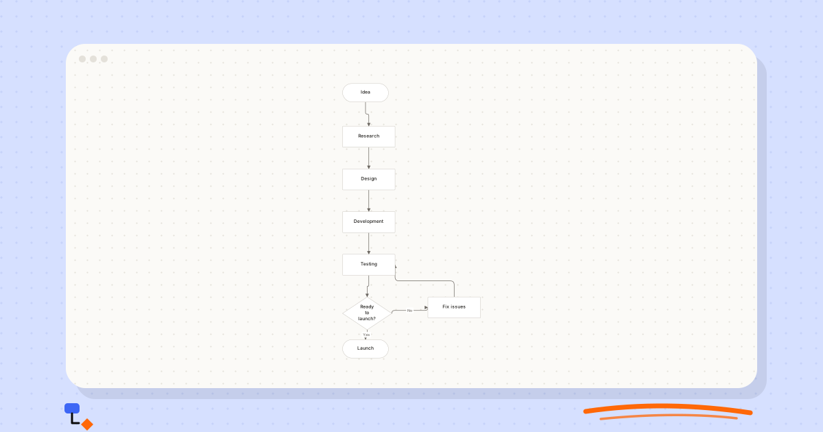
A flowchart should not need a meeting to explain it. Yet most organisations have a few that do: diagrams that made sense to the person who drew them and to nobody since. They tend to fail in the same handful of ways, and nearly all of them can be fixed without redrawing from scratch.
This article covers what makes the difference: direction, a visible main path, consistent granularity, labels that carry their weight, loops that read as loops, and layout that tells the truth. A worked example takes a muddled support process and repairs it one change at a time.
Pick a direction and keep it
Flow downward, or flow rightward, but do not do both in the same diagram. Readers build an expectation from the first two connectors, and every violation after that costs them a moment of reorientation. A chart that runs down, then right, then down again across a gap reads like a set of directions with a missing page.
The exception is a loop back to an earlier step, which by definition runs against the flow. That is fine, and it is exactly why keeping everything else consistent matters. A backward line is informative precisely because it is the only one.
%20scale(0.46)%20translate(-260%2C0)%22%3E%3Cline%20x1%3D%22330%22%20y1%3D%2228%22%20x2%3D%22340%22%20y2%3D%22162%22%20stroke%3D%22%236b6660%22%20stroke-width%3D%221.5%22%2F%3E%3Cline%20x1%3D%22340%22%20y1%3D%22162%22%20x2%3D%22340%22%20y2%3D%22292%22%20stroke%3D%22%236b6660%22%20stroke-width%3D%221.5%22%2F%3E%3Cline%20x1%3D%22340%22%20y1%3D%22292%22%20x2%3D%22340%22%20y2%3D%22422%22%20stroke%3D%22%236b6660%22%20stroke-width%3D%221.5%22%2F%3E%3Cline%20x1%3D%22340%22%20y1%3D%22422%22%20x2%3D%22340%22%20y2%3D%22552%22%20stroke%3D%22%236b6660%22%20stroke-width%3D%221.5%22%2F%3E%3Cline%20x1%3D%22340%22%20y1%3D%22552%22%20x2%3D%22335%22%20y2%3D%22700%22%20stroke%3D%22%236b6660%22%20stroke-width%3D%221.5%22%2F%3E%3Cline%20x1%3D%22335%22%20y1%3D%22700%22%20x2%3D%22330%22%20y2%3D%22808%22%20stroke%3D%22%236b6660%22%20stroke-width%3D%221.5%22%2F%3E%3Cline%20x1%3D%22335%22%20y1%3D%22700%22%20x2%3D%22600%22%20y2%3D%22682%22%20stroke%3D%22%236b6660%22%20stroke-width%3D%221.5%22%2F%3E%3Cline%20x1%3D%22600%22%20y1%3D%22682%22%20x2%3D%22340%22%20y2%3D%22552%22%20stroke%3D%22%236b6660%22%20stroke-width%3D%221.5%22%2F%3E%3Cg%20transform%3D%22translate(260%2C0)%22%20opacity%3D%221%22%3E%3Crect%20x%3D%220%22%20y%3D%220%22%20width%3D%22140%22%20height%3D%2256%22%20rx%3D%2228%22%20fill%3D%22%23ffffff%22%20stroke%3D%22%23c8c4bd%22%20stroke-width%3D%221%22%2F%3E%3C%2Fg%3E%3Cg%20transform%3D%22translate(260%2C130)%22%20opacity%3D%221%22%3E%3Crect%20x%3D%220%22%20y%3D%220%22%20width%3D%22160%22%20height%3D%2264%22%20rx%3D%222%22%20fill%3D%22%23ffffff%22%20stroke%3D%22%23c8c4bd%22%20stroke-width%3D%221%22%2F%3E%3C%2Fg%3E%3Cg%20transform%3D%22translate(260%2C260)%22%20opacity%3D%221%22%3E%3Crect%20x%3D%220%22%20y%3D%220%22%20width%3D%22160%22%20height%3D%2264%22%20rx%3D%222%22%20fill%3D%22%23ffffff%22%20stroke%3D%22%23c8c4bd%22%20stroke-width%3D%221%22%2F%3E%3C%2Fg%3E%3Cg%20transform%3D%22translate(260%2C390)%22%20opacity%3D%221%22%3E%3Crect%20x%3D%220%22%20y%3D%220%22%20width%3D%22160%22%20height%3D%2264%22%20rx%3D%222%22%20fill%3D%22%23ffffff%22%20stroke%3D%22%23c8c4bd%22%20stroke-width%3D%221%22%2F%3E%3C%2Fg%3E%3Cg%20transform%3D%22translate(260%2C520)%22%20opacity%3D%221%22%3E%3Crect%20x%3D%220%22%20y%3D%220%22%20width%3D%22160%22%20height%3D%2264%22%20rx%3D%222%22%20fill%3D%22%23ffffff%22%20stroke%3D%22%23c8c4bd%22%20stroke-width%3D%221%22%2F%3E%3C%2Fg%3E%3Cg%20transform%3D%22translate(260%2C650)%22%20opacity%3D%221%22%3E%3Cpath%20d%3D%22M75%2C0%20L150%2C50%20L75%2C100%20L0%2C50%20Z%22%20fill%3D%22%23ffffff%22%20stroke%3D%22%23c8c4bd%22%20stroke-width%3D%221%22%2F%3E%3C%2Fg%3E%3Cg%20transform%3D%22translate(520%2C650)%22%20opacity%3D%221%22%3E%3Crect%20x%3D%220%22%20y%3D%220%22%20width%3D%22160%22%20height%3D%2264%22%20rx%3D%222%22%20fill%3D%22%23ffffff%22%20stroke%3D%22%23c8c4bd%22%20stroke-width%3D%221%22%2F%3E%3C%2Fg%3E%3Cg%20transform%3D%22translate(260%2C780)%22%20opacity%3D%221%22%3E%3Crect%20x%3D%220%22%20y%3D%220%22%20width%3D%22140%22%20height%3D%2256%22%20rx%3D%2228%22%20fill%3D%22%23ffffff%22%20stroke%3D%22%23c8c4bd%22%20stroke-width%3D%221%22%2F%3E%3C%2Fg%3E%3C%2Fg%3E%3C%2Fsvg%3E)
Which direction? Top to bottom suits long processes and documents read on a page. Left to right suits slides and wide screens, and it pairs well with swimlanes, where the lanes run horizontally and time moves across them. What matters is the choice, not the answer.
Make the main path a straight line
Most processes have a common case: the order that is paid for and in stock, the application that meets the requirements. Readers want to find it first and the exceptions second. Put the common case on a straight spine running in your chosen direction, and let exceptions branch off to the side.
This has a practical rule attached. At each decision, the branch that continues the main path should leave in the direction of flow, and the exception should leave sideways. Do this consistently and a reader can trace the normal case with a finger without reading a single label, then go back for the branches.
Endings follow the same logic. The successful end belongs at the far end of the spine, where the reader's eye naturally finishes. Failure ends, such as "Order cancelled" or "Declined with explanation", sit beside the decision that produced them, so the reader sees cause and outcome together instead of chasing a long line across the page to find out what a No means.
A quick test: cover every decision diamond with your thumb and look only at the straight line down the middle. If what remains describes the normal case in order, the layout is doing its job.
Hold one level of detail
A subtle readability problem is mixing altitudes. A chart that goes "Receive application" and then "Open the applicant record, check the reference against the register and confirm the postcode format" is describing the process at two different heights in the same picture.
Readers use box size and position to judge importance, so a thirty-second step beside a three-week step reads as though they were comparable. They are not, and the diagram quietly misrepresents the shape of the process.
Pick an altitude and hold it. If one step needs unpacking, draw it as its own diagram rather than inflating it in place. A useful test: could each box plausibly be one person's single piece of work? If some boxes are a task and others are a department's quarter, the granularity has slipped.
The same thinking trims the box count. If a step's detail would not change anyone's decision, it does not need its own box. "Log in to the system" is rarely a step; it is a precondition. If the chart no longer fits on one screen at a readable zoom, it is usually two processes that deserve separate diagrams.
Labels that carry their weight
The label is where most of the meaning lives, so it is where most readability problems hide. Each kind of element has a pattern that works.
| Element | Weak label | Strong label | Why |
|---|---|---|---|
| Start | Start | Ticket received | Names the trigger |
| Step | Processing | Triage and categorise | Verb and object; someone could do it |
| Decision | OK? | Known issue? | Answerable with the information at hand |
| Branch | (none) | Yes / No | The reader can choose a path |
| Handoff | Send to review | Escalate to engineering | Says who receives it |
| End | End | Ticket closed | Names the end state |
Every path leaving a decision needs a label. This sounds obvious and is violated constantly, because the author knows which branch is which and forgets that nobody else does. Yes and No are fine and better than clever alternatives. Approved and Rejected read well for review steps. Where a decision has more than two answers, check the answers cannot overlap.
Watch for internal shorthand. Abbreviations that are obvious inside a team are opaque outside it, and system names mean nothing to someone who has never used the system. "Update CRM" is clearer as "Record the call in the customer database" for any reader who is not already on the team.
Every path ends, and loops look like loops
Follow every branch to an explicit ending. A path that trails off is a process nobody has thought through. When you draw the rejection branch and discover you do not know what happens next, you have found something more valuable than a tidy diagram.
Loops need the same care. A loop should leave from a decision, run backwards against the flow, and re-enter at the step that is genuinely repeated. Two things make loops hard to read: re-entering at the wrong step, so the reader cannot tell what is redone, and loops with no way out, where nothing on the diagram says when the repetition stops.
%20scale(0.46)%20translate(0%2C0)%22%3E%3Cline%20x1%3D%22330%22%20y1%3D%2228%22%20x2%3D%22335%22%20y2%3D%22180%22%20stroke%3D%22%236b6660%22%20stroke-width%3D%221.5%22%2F%3E%3Cline%20x1%3D%22335%22%20y1%3D%22180%22%20x2%3D%2270%22%20y2%3D%22158%22%20stroke%3D%22%236b6660%22%20stroke-width%3D%221.5%22%2F%3E%3Cline%20x1%3D%22335%22%20y1%3D%22180%22%20x2%3D%22335%22%20y2%3D%22310%22%20stroke%3D%22%236b6660%22%20stroke-width%3D%221.5%22%2F%3E%3Cline%20x1%3D%22335%22%20y1%3D%22310%22%20x2%3D%22600%22%20y2%3D%22292%22%20stroke%3D%22%236b6660%22%20stroke-width%3D%221.5%22%2F%3E%3Cline%20x1%3D%22600%22%20y1%3D%22292%22%20x2%3D%22335%22%20y2%3D%22310%22%20stroke%3D%22%236b6660%22%20stroke-width%3D%221.5%22%2F%3E%3Cline%20x1%3D%22335%22%20y1%3D%22310%22%20x2%3D%22340%22%20y2%3D%22422%22%20stroke%3D%22%236b6660%22%20stroke-width%3D%221.5%22%2F%3E%3Cline%20x1%3D%22340%22%20y1%3D%22422%22%20x2%3D%22340%22%20y2%3D%22552%22%20stroke%3D%22%236b6660%22%20stroke-width%3D%221.5%22%2F%3E%3Cline%20x1%3D%22340%22%20y1%3D%22552%22%20x2%3D%22340%22%20y2%3D%22682%22%20stroke%3D%22%236b6660%22%20stroke-width%3D%221.5%22%2F%3E%3Cline%20x1%3D%22340%22%20y1%3D%22682%22%20x2%3D%22330%22%20y2%3D%22808%22%20stroke%3D%22%236b6660%22%20stroke-width%3D%221.5%22%2F%3E%3Cg%20transform%3D%22translate(260%2C0)%22%20opacity%3D%221%22%3E%3Crect%20x%3D%220%22%20y%3D%220%22%20width%3D%22140%22%20height%3D%2256%22%20rx%3D%2228%22%20fill%3D%22%23ffffff%22%20stroke%3D%22%23c8c4bd%22%20stroke-width%3D%221%22%2F%3E%3C%2Fg%3E%3Cg%20transform%3D%22translate(260%2C130)%22%20opacity%3D%221%22%3E%3Cpath%20d%3D%22M75%2C0%20L150%2C50%20L75%2C100%20L0%2C50%20Z%22%20fill%3D%22%23ffffff%22%20stroke%3D%22%23c8c4bd%22%20stroke-width%3D%221%22%2F%3E%3C%2Fg%3E%3Cg%20transform%3D%22translate(0%2C130)%22%20opacity%3D%221%22%3E%3Crect%20x%3D%220%22%20y%3D%220%22%20width%3D%22140%22%20height%3D%2256%22%20rx%3D%2228%22%20fill%3D%22%23ffffff%22%20stroke%3D%22%23c8c4bd%22%20stroke-width%3D%221%22%2F%3E%3C%2Fg%3E%3Cg%20transform%3D%22translate(260%2C260)%22%20opacity%3D%221%22%3E%3Cpath%20d%3D%22M75%2C0%20L150%2C50%20L75%2C100%20L0%2C50%20Z%22%20fill%3D%22%23ffffff%22%20stroke%3D%22%23c8c4bd%22%20stroke-width%3D%221%22%2F%3E%3C%2Fg%3E%3Cg%20transform%3D%22translate(520%2C260)%22%20opacity%3D%221%22%3E%3Crect%20x%3D%220%22%20y%3D%220%22%20width%3D%22160%22%20height%3D%2264%22%20rx%3D%222%22%20fill%3D%22%23ffffff%22%20stroke%3D%22%23c8c4bd%22%20stroke-width%3D%221%22%2F%3E%3C%2Fg%3E%3Cg%20transform%3D%22translate(260%2C390)%22%20opacity%3D%221%22%3E%3Crect%20x%3D%220%22%20y%3D%220%22%20width%3D%22160%22%20height%3D%2264%22%20rx%3D%222%22%20fill%3D%22%23ffffff%22%20stroke%3D%22%23c8c4bd%22%20stroke-width%3D%221%22%2F%3E%3C%2Fg%3E%3Cg%20transform%3D%22translate(260%2C520)%22%20opacity%3D%221%22%3E%3Crect%20x%3D%220%22%20y%3D%220%22%20width%3D%22160%22%20height%3D%2264%22%20rx%3D%222%22%20fill%3D%22%23ffffff%22%20stroke%3D%22%23c8c4bd%22%20stroke-width%3D%221%22%2F%3E%3C%2Fg%3E%3Cg%20transform%3D%22translate(260%2C650)%22%20opacity%3D%221%22%3E%3Crect%20x%3D%220%22%20y%3D%220%22%20width%3D%22160%22%20height%3D%2264%22%20rx%3D%222%22%20fill%3D%22%23ffffff%22%20stroke%3D%22%23c8c4bd%22%20stroke-width%3D%221%22%2F%3E%3C%2Fg%3E%3Cg%20transform%3D%22translate(260%2C780)%22%20opacity%3D%221%22%3E%3Crect%20x%3D%220%22%20y%3D%220%22%20width%3D%22140%22%20height%3D%2256%22%20rx%3D%2228%22%20fill%3D%22%23ffffff%22%20stroke%3D%22%23c8c4bd%22%20stroke-width%3D%221%22%2F%3E%3C%2Fg%3E%3C%2Fg%3E%3C%2Fsvg%3E)
In the order fulfilment example, the backorder loop returns to the stock check rather than to the start, which tells the reader that payment is not taken again. That single choice about where the arrow lands carries a piece of policy.
Layout that tells the truth
Alignment is not decoration. A reader scanning a column of aligned boxes reads them as the main sequence; a box nudged out of the column reads as an aside, whether or not you meant it to. Three boxes that are almost aligned make readers wonder whether the difference means something. Use alignment tools rather than eyeballing it.
Crossing lines are a signal. The occasional crossing is unavoidable. Frequent ones usually mean steps that interact are far apart. Moving boxes normally fixes it; if it does not, the process itself may be more tangled than the diagram, which is a finding in its own right.
Automatic layout helps, but apply it deliberately. Layout algorithms optimise for fewer crossings and compactness, which is not always the same as readability. A hand-arranged chart that keeps the main path straight and groups related exceptions often reads better than a mathematically tidier one. A good approach is to run automatic layout first, then adjust by hand.
Size and colour make claims too. A box drawn larger than its neighbours reads as more important, so keep step boxes the same size unless importance is the point. Colour is best kept for a small number of categories that a legend or the labels explain, such as marking the steps a customer sees. Never let colour be the only thing carrying meaning: it disappears on a monochrome printout and for readers who cannot tell the shades apart. Generous, even spacing does more for readability than any styling, because it lets the eye group steps without effort.
Worked example: repairing a support process
Imagine a support team's first draft of their ticket process. It has eleven boxes. It starts with "New ticket", runs down for three steps, turns right for no particular reason, and has a diamond labelled "Can we fix?" with two unlabelled lines leaving it. One of those lines goes to a box reading "Eng", which has no line out. There is a box reading "Log in to helpdesk" and another reading "Investigate the issue, check the logs, reproduce the bug and draft a reply".
Here is how it gets repaired, one change at a time.
- Rename the ends. "New ticket" becomes "Ticket received", and the missing end becomes "Ticket closed".
- Delete the precondition. "Log in to helpdesk" goes; it is not a step anyone needs to see.
- Split the vague question. "Can we fix?" hides two decisions: whether this is a known issue with a documented fix, and if not, whether it needs engineering. Each becomes its own diamond with Yes and No branches.
- Break up the overloaded box. The four-action investigation box becomes one step, "Investigate", at the same altitude as the others; the detail goes into the support team's own runbook.
- Finish the dead end. "Eng" becomes "Escalate to engineering", and it now leads to "Confirm with customer", like every other route.
- Straighten the spine. The main path, from triage through investigation to confirmation, now runs in one direction with the known-fix and escalation branches off to the side.
%20scale(0.46)%20translate(0%2C0)%22%3E%3Cline%20x1%3D%22330%22%20y1%3D%2228%22%20x2%3D%22340%22%20y2%3D%22162%22%20stroke%3D%22%236b6660%22%20stroke-width%3D%221.5%22%2F%3E%3Cline%20x1%3D%22340%22%20y1%3D%22162%22%20x2%3D%22335%22%20y2%3D%22310%22%20stroke%3D%22%236b6660%22%20stroke-width%3D%221.5%22%2F%3E%3Cline%20x1%3D%22335%22%20y1%3D%22310%22%20x2%3D%2280%22%20y2%3D%22422%22%20stroke%3D%22%236b6660%22%20stroke-width%3D%221.5%22%2F%3E%3Cline%20x1%3D%22335%22%20y1%3D%22310%22%20x2%3D%22600%22%20y2%3D%22422%22%20stroke%3D%22%236b6660%22%20stroke-width%3D%221.5%22%2F%3E%3Cline%20x1%3D%22600%22%20y1%3D%22422%22%20x2%3D%22595%22%20y2%3D%22570%22%20stroke%3D%22%236b6660%22%20stroke-width%3D%221.5%22%2F%3E%3Cline%20x1%3D%22595%22%20y1%3D%22570%22%20x2%3D%22860%22%20y2%3D%22552%22%20stroke%3D%22%236b6660%22%20stroke-width%3D%221.5%22%2F%3E%3Cline%20x1%3D%22595%22%20y1%3D%22570%22%20x2%3D%22340%22%20y2%3D%22682%22%20stroke%3D%22%236b6660%22%20stroke-width%3D%221.5%22%2F%3E%3Cline%20x1%3D%2280%22%20y1%3D%22422%22%20x2%3D%22340%22%20y2%3D%22682%22%20stroke%3D%22%236b6660%22%20stroke-width%3D%221.5%22%2F%3E%3Cline%20x1%3D%22860%22%20y1%3D%22552%22%20x2%3D%22340%22%20y2%3D%22682%22%20stroke%3D%22%236b6660%22%20stroke-width%3D%221.5%22%2F%3E%3Cline%20x1%3D%22340%22%20y1%3D%22682%22%20x2%3D%22330%22%20y2%3D%22808%22%20stroke%3D%22%236b6660%22%20stroke-width%3D%221.5%22%2F%3E%3Cg%20transform%3D%22translate(260%2C0)%22%20opacity%3D%221%22%3E%3Crect%20x%3D%220%22%20y%3D%220%22%20width%3D%22140%22%20height%3D%2256%22%20rx%3D%2228%22%20fill%3D%22%23ffffff%22%20stroke%3D%22%23c8c4bd%22%20stroke-width%3D%221%22%2F%3E%3C%2Fg%3E%3Cg%20transform%3D%22translate(260%2C130)%22%20opacity%3D%221%22%3E%3Crect%20x%3D%220%22%20y%3D%220%22%20width%3D%22160%22%20height%3D%2264%22%20rx%3D%222%22%20fill%3D%22%23ffffff%22%20stroke%3D%22%23c8c4bd%22%20stroke-width%3D%221%22%2F%3E%3C%2Fg%3E%3Cg%20transform%3D%22translate(260%2C260)%22%20opacity%3D%221%22%3E%3Cpath%20d%3D%22M75%2C0%20L150%2C50%20L75%2C100%20L0%2C50%20Z%22%20fill%3D%22%23ffffff%22%20stroke%3D%22%23c8c4bd%22%20stroke-width%3D%221%22%2F%3E%3C%2Fg%3E%3Cg%20transform%3D%22translate(0%2C390)%22%20opacity%3D%221%22%3E%3Crect%20x%3D%220%22%20y%3D%220%22%20width%3D%22160%22%20height%3D%2264%22%20rx%3D%222%22%20fill%3D%22%23ffffff%22%20stroke%3D%22%23c8c4bd%22%20stroke-width%3D%221%22%2F%3E%3C%2Fg%3E%3Cg%20transform%3D%22translate(520%2C390)%22%20opacity%3D%221%22%3E%3Crect%20x%3D%220%22%20y%3D%220%22%20width%3D%22160%22%20height%3D%2264%22%20rx%3D%222%22%20fill%3D%22%23ffffff%22%20stroke%3D%22%23c8c4bd%22%20stroke-width%3D%221%22%2F%3E%3C%2Fg%3E%3Cg%20transform%3D%22translate(520%2C520)%22%20opacity%3D%221%22%3E%3Cpath%20d%3D%22M75%2C0%20L150%2C50%20L75%2C100%20L0%2C50%20Z%22%20fill%3D%22%23ffffff%22%20stroke%3D%22%23c8c4bd%22%20stroke-width%3D%221%22%2F%3E%3C%2Fg%3E%3Cg%20transform%3D%22translate(780%2C520)%22%20opacity%3D%221%22%3E%3Crect%20x%3D%220%22%20y%3D%220%22%20width%3D%22160%22%20height%3D%2264%22%20rx%3D%222%22%20fill%3D%22%23ffffff%22%20stroke%3D%22%23c8c4bd%22%20stroke-width%3D%221%22%2F%3E%3C%2Fg%3E%3Cg%20transform%3D%22translate(260%2C650)%22%20opacity%3D%221%22%3E%3Crect%20x%3D%220%22%20y%3D%220%22%20width%3D%22160%22%20height%3D%2264%22%20rx%3D%222%22%20fill%3D%22%23ffffff%22%20stroke%3D%22%23c8c4bd%22%20stroke-width%3D%221%22%2F%3E%3C%2Fg%3E%3Cg%20transform%3D%22translate(260%2C780)%22%20opacity%3D%221%22%3E%3Crect%20x%3D%220%22%20y%3D%220%22%20width%3D%22140%22%20height%3D%2256%22%20rx%3D%2228%22%20fill%3D%22%23ffffff%22%20stroke%3D%22%23c8c4bd%22%20stroke-width%3D%221%22%2F%3E%3C%2Fg%3E%3C%2Fg%3E%3C%2Fsvg%3E)
The result has nine boxes instead of eleven, every branch is labelled, every path ends, and the escalation handoff is visible rather than assumed. Nothing about the team's process changed. Only the diagram did, and it can now be read by someone who was not there when it was drawn.
Test it on someone who was not in the room
Most unreadable flowcharts were readable to their author, because the author carried the missing context. The test is whether someone with no prior knowledge can follow it. Hand it to a colleague from a different team and ask them to talk through what happens. Every place they hesitate is a place the diagram relies on knowledge it has not supplied. Usually the fix is a better label rather than another box.
- Does every forward line run in one direction, with backward lines only for genuine loops?
- Can you trace the common case along a straight path without reading the branches?
- Does every path leaving a decision carry a label, and do the answers cover every case without overlapping?
- Does every path reach an explicit end?
- Are all boxes at roughly the same level of detail?
- Are crossings rare, and does each one have a reason?
- Could someone outside your team follow it without asking a question?
Doing this in DiagramDock
A few features map directly onto the checklist above. The suggestions panel flags unlabelled decision branches and steps that nothing leads to, without changing anything for you. Decision branches take one-click Yes, No, Approved or Rejected labels. "Arrange diagram" lays the chart out top to bottom or left to right when you ask it to, and a single undo puts every box back if you preferred your own arrangement.
Questions
- How many steps is too many for one flowchart?
- There is no fixed number. If you cannot see the whole chart at a zoom where the labels are readable, split it. Two clear diagrams, each with a name, beat one complete but unreadable one.
- Should a flowchart run top to bottom or left to right?
- Either works. Top to bottom suits long sequences and portrait pages; left to right suits slides and wide screens and pairs naturally with swimlanes. Pick one and keep every forward line running that way.
- Should I use colour in a flowchart?
- Sparingly, and never as the only signal. Colour that marks a small number of explained categories helps. Colour that carries meaning nobody has explained does not, and it fails for readers who cannot tell the colours apart or who print in monochrome.
- How do I show that two steps happen at the same time?
- Let one step lead to both, then have both lead into a single step that waits for them, and say so in its label, for example "Ready before start date?". If parallel work is the main story, a swimlane diagram usually shows it more clearly.
Keep reading
Flowcharts11 min read
Flowchart symbols explained without the jargon
What each flowchart shape means, the four you need for almost every diagram, when the specialised ones earn their place, and how shapes get misused.
Flowcharts9 min read
Seven flowchart mistakes that make processes harder to understand
Unlabelled branches, dead ends, vague questions and six other habits that make flowcharts misleading, with how to spot each one and how to fix it.
Diagramming9 min read
When an automatic diagram layout helps, and when it doesn't
What layout algorithms optimise, where they save time (trees, imports, large graphs), where they erase meaning (lanes, timelines, groupings), and a workflow.
Diagramming9 min read
Decision trees vs flowcharts: which one fits the problem?
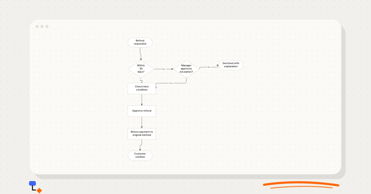
Trees branch and never rejoin; flowcharts loop and merge. How that one structural difference decides which diagram to draw, with a refund policy drawn both ways.