Flowchart symbols explained without the jargon
What each flowchart shape means, the four you need for almost every diagram, when the specialised ones earn their place, and how shapes get misused.
The DiagramDock team · · Updated · 11 min read
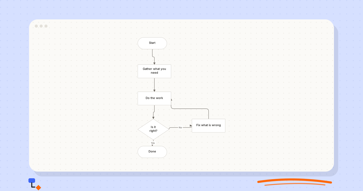
Flowchart notation looks as though a committee must have designed it, and one did. There is an international standard with symbols for punched cards and magnetic tape. Almost nobody needs the full set. Most useful flowcharts use four shapes, and knowing which four, and exactly what each one promises the reader, is worth more than memorising the other dozen.
This guide covers the core shapes, the specialised ones and when they earn a place, the connectors that people forget are symbols too, and the misuses that make a diagram harder to read than a numbered list. A worked example at the end takes one refund policy through three levels of notation so you can see where extra shapes help and where they get in the way.
The four shapes you actually need
Terminator: where the process starts and stops
A rounded rectangle, or a stadium shape with fully round ends, marks a start or an end. Label it with the event, not the word. "Refund requested" is a better start than "Start", because it tells the reader what triggers the process. "Customer notified" is a better end than "End", because it tells them what is true when the process has finished.
Every flowchart needs at least one start and at least one end. Several ends are normal: a hiring process can finish with an offer or with a rejection. If yours has no end at all, either the process loops forever or you have not finished drawing it, and both are worth knowing.
Process: a step that does something
A plain rectangle is the workhorse. It holds one action, written as a verb and an object: "Check item condition", "Raise purchase order". If you are unsure which shape to use, a rectangle is almost always defensible, and a reader will never be confused by one.
One rectangle, one action. A box that reads "Check the form, update the record and email the customer" is three steps sharing a border, and the diagram can no longer show what happens if the second one fails.
Decision: a question with defined answers
A diamond asks a question, and every path leaving it carries an answer. The question must be answerable by whoever is standing at that point in the process with the information they actually have. "Within 30 days of purchase?" works. "Is this reasonable?" does not, because two people will answer it differently.
An unlabelled branch out of a diamond is the single most common flowchart defect. The author knows which line is Yes. Nobody else does.
Input or output: data crossing the boundary
A parallelogram shows information arriving in or leaving the process: a form submitted, a report sent, a reading taken. Use it when the movement of information is the point. If every step involves a screen, do not turn every step into a parallelogram; the shape then stops distinguishing anything.
%20scale(0.67)%20translate(-260%2C0)%22%3E%3Cline%20x1%3D%22330%22%20y1%3D%2228%22%20x2%3D%22340%22%20y2%3D%22162%22%20stroke%3D%22%236b6660%22%20stroke-width%3D%221.5%22%2F%3E%3Cline%20x1%3D%22340%22%20y1%3D%22162%22%20x2%3D%22340%22%20y2%3D%22292%22%20stroke%3D%22%236b6660%22%20stroke-width%3D%221.5%22%2F%3E%3Cline%20x1%3D%22340%22%20y1%3D%22292%22%20x2%3D%22335%22%20y2%3D%22440%22%20stroke%3D%22%236b6660%22%20stroke-width%3D%221.5%22%2F%3E%3Cline%20x1%3D%22335%22%20y1%3D%22440%22%20x2%3D%22330%22%20y2%3D%22548%22%20stroke%3D%22%236b6660%22%20stroke-width%3D%221.5%22%2F%3E%3Cline%20x1%3D%22335%22%20y1%3D%22440%22%20x2%3D%22600%22%20y2%3D%22422%22%20stroke%3D%22%236b6660%22%20stroke-width%3D%221.5%22%2F%3E%3Cline%20x1%3D%22600%22%20y1%3D%22422%22%20x2%3D%22340%22%20y2%3D%22292%22%20stroke%3D%22%236b6660%22%20stroke-width%3D%221.5%22%2F%3E%3Cg%20transform%3D%22translate(260%2C0)%22%20opacity%3D%221%22%3E%3Crect%20x%3D%220%22%20y%3D%220%22%20width%3D%22140%22%20height%3D%2256%22%20rx%3D%2228%22%20fill%3D%22%23ffffff%22%20stroke%3D%22%23c8c4bd%22%20stroke-width%3D%221%22%2F%3E%3C%2Fg%3E%3Cg%20transform%3D%22translate(260%2C130)%22%20opacity%3D%221%22%3E%3Crect%20x%3D%220%22%20y%3D%220%22%20width%3D%22160%22%20height%3D%2264%22%20rx%3D%222%22%20fill%3D%22%23ffffff%22%20stroke%3D%22%23c8c4bd%22%20stroke-width%3D%221%22%2F%3E%3C%2Fg%3E%3Cg%20transform%3D%22translate(260%2C260)%22%20opacity%3D%221%22%3E%3Crect%20x%3D%220%22%20y%3D%220%22%20width%3D%22160%22%20height%3D%2264%22%20rx%3D%222%22%20fill%3D%22%23ffffff%22%20stroke%3D%22%23c8c4bd%22%20stroke-width%3D%221%22%2F%3E%3C%2Fg%3E%3Cg%20transform%3D%22translate(260%2C390)%22%20opacity%3D%221%22%3E%3Cpath%20d%3D%22M75%2C0%20L150%2C50%20L75%2C100%20L0%2C50%20Z%22%20fill%3D%22%23ffffff%22%20stroke%3D%22%23c8c4bd%22%20stroke-width%3D%221%22%2F%3E%3C%2Fg%3E%3Cg%20transform%3D%22translate(520%2C390)%22%20opacity%3D%221%22%3E%3Crect%20x%3D%220%22%20y%3D%220%22%20width%3D%22160%22%20height%3D%2264%22%20rx%3D%222%22%20fill%3D%22%23ffffff%22%20stroke%3D%22%23c8c4bd%22%20stroke-width%3D%221%22%2F%3E%3C%2Fg%3E%3Cg%20transform%3D%22translate(260%2C520)%22%20opacity%3D%221%22%3E%3Crect%20x%3D%220%22%20y%3D%220%22%20width%3D%22140%22%20height%3D%2256%22%20rx%3D%2228%22%20fill%3D%22%23ffffff%22%20stroke%3D%22%23c8c4bd%22%20stroke-width%3D%221%22%2F%3E%3C%2Fg%3E%3C%2Fg%3E%3C%2Fsvg%3E)
Arrows are symbols too
The flowline is the part of the notation people take for granted, and it carries as much meaning as any shape. An arrow says "this happens next". It does not say "this is related to" or "this is informed by". If you need a line that means something other than sequence, a flowchart is probably the wrong diagram.
- Always use arrowheads. A line without one forces the reader to infer direction from position, and loops make that impossible.
- Lines may merge into a step. Two branches that both lead to "Raise purchase order" should meet at that box rather than duplicating it.
- Lines out of a process step should not split without a decision. If one step leads to two different places, either there is a hidden question or the two things happen in parallel, and the reader needs to know which.
- Label lines only where it adds information. Decision branches always; ordinary sequence lines rarely.
Parallel work deserves a note. Formal notations have a parallel mode symbol, a pair of horizontal bars where flow splits and later rejoins. In everyday diagrams it is clearer to let one step lead to two, then have both lead into a single step that waits for both, and say so in that step's label: "Ready before start date?" makes the waiting explicit without any special symbol.
The specialised shapes, and when they earn their place
Beyond the core four, most tools offer a palette of more specific shapes. Some come from the standard and some are conventions that grew up around it. Each is worth using when the distinction genuinely matters to the reader, and worth avoiding when it does not.
| Shape | What it means | Use it when | Skip it when |
|---|---|---|---|
| Document (rectangle with a wavy bottom) | A printed or written record | The artefact itself matters: a contract, an invoice, a signed form | The document is just the medium for an ordinary step |
| Multiple documents | Several records of the same kind | A batch is produced or consumed, such as a set of payslips | One document would tell the same story |
| Stored data (cylinder) | Data held in a database or file | A step reads from or writes to a system the reader should know about | Every step touches the same database; say it once in a note |
| Predefined process (rectangle with doubled sides) | A step defined in another diagram | A sub-process has its own diagram and owner | There is no other diagram for the reader to look at |
| Manual input (slanted top) | Someone types something in | Human entry versus automated input changes how the process behaves | Nobody would make a different decision knowing it |
| Manual operation (trapezium) | A step done by hand, not by a system | You are mapping what to automate | The whole process is manual |
| Preparation (hexagon) | Setup before the next step | There is setup that can fail on its own | It is just another step; use a rectangle |
| Delay (half-rounded rectangle) | Waiting | The wait is the problem you are drawing | The wait is incidental |
| Display | Information shown on screen | You are documenting what a user sees at each point | A user flow diagram would do the job better |
| On-page connector (small circle) | Flow jumps to a matching circle elsewhere on the page | A line would cross half the diagram | Moving the boxes would remove the need |
| Off-page connector | Flow continues on another page | The diagram is printed across several sheets | The second page should really be its own diagram |
| Annotation (open bracket) | A comment, not a step | A step needs a caveat the label cannot hold | The note repeats the label |
A useful test for any specialised shape: if you replaced it with a plain rectangle, would a reader miss anything? If not, the shape is decoration. If they would, it is carrying meaning and has earned its place.
Worked example: one refund policy, three levels of notation
Take a small shop's refund policy. Refunds are allowed within 30 days of purchase. Outside 30 days, a manager can approve an exception. Approved items are checked for condition, the refund goes back to the original payment method, and the customer is told the outcome.
Level one: the core four
Start with a terminator, "Refund requested". The first question is a diamond, "Within 30 days?". Yes leads to a rectangle, "Check item condition". No leads to a second diamond, "Manager approves exception?", whose Yes branch merges into the same "Check item condition" box and whose No branch leads to "Declined with explanation". From the condition check, the flow runs through "Approve refund" and "Return payment to original method" to a final terminator, "Customer notified".
%20scale(0.55)%20translate(-260%2C0)%22%3E%3Cline%20x1%3D%22330%22%20y1%3D%2228%22%20x2%3D%22335%22%20y2%3D%22180%22%20stroke%3D%22%236b6660%22%20stroke-width%3D%221.5%22%2F%3E%3Cline%20x1%3D%22335%22%20y1%3D%22180%22%20x2%3D%22595%22%20y2%3D%22180%22%20stroke%3D%22%236b6660%22%20stroke-width%3D%221.5%22%2F%3E%3Cline%20x1%3D%22595%22%20y1%3D%22180%22%20x2%3D%22850%22%20y2%3D%22158%22%20stroke%3D%22%236b6660%22%20stroke-width%3D%221.5%22%2F%3E%3Cline%20x1%3D%22595%22%20y1%3D%22180%22%20x2%3D%22340%22%20y2%3D%22292%22%20stroke%3D%22%236b6660%22%20stroke-width%3D%221.5%22%2F%3E%3Cline%20x1%3D%22335%22%20y1%3D%22180%22%20x2%3D%22340%22%20y2%3D%22292%22%20stroke%3D%22%236b6660%22%20stroke-width%3D%221.5%22%2F%3E%3Cline%20x1%3D%22340%22%20y1%3D%22292%22%20x2%3D%22340%22%20y2%3D%22422%22%20stroke%3D%22%236b6660%22%20stroke-width%3D%221.5%22%2F%3E%3Cline%20x1%3D%22340%22%20y1%3D%22422%22%20x2%3D%22340%22%20y2%3D%22552%22%20stroke%3D%22%236b6660%22%20stroke-width%3D%221.5%22%2F%3E%3Cline%20x1%3D%22340%22%20y1%3D%22552%22%20x2%3D%22330%22%20y2%3D%22678%22%20stroke%3D%22%236b6660%22%20stroke-width%3D%221.5%22%2F%3E%3Cg%20transform%3D%22translate(260%2C0)%22%20opacity%3D%221%22%3E%3Crect%20x%3D%220%22%20y%3D%220%22%20width%3D%22140%22%20height%3D%2256%22%20rx%3D%2228%22%20fill%3D%22%23ffffff%22%20stroke%3D%22%23c8c4bd%22%20stroke-width%3D%221%22%2F%3E%3C%2Fg%3E%3Cg%20transform%3D%22translate(260%2C130)%22%20opacity%3D%221%22%3E%3Cpath%20d%3D%22M75%2C0%20L150%2C50%20L75%2C100%20L0%2C50%20Z%22%20fill%3D%22%23ffffff%22%20stroke%3D%22%23c8c4bd%22%20stroke-width%3D%221%22%2F%3E%3C%2Fg%3E%3Cg%20transform%3D%22translate(520%2C130)%22%20opacity%3D%221%22%3E%3Cpath%20d%3D%22M75%2C0%20L150%2C50%20L75%2C100%20L0%2C50%20Z%22%20fill%3D%22%23ffffff%22%20stroke%3D%22%23c8c4bd%22%20stroke-width%3D%221%22%2F%3E%3C%2Fg%3E%3Cg%20transform%3D%22translate(780%2C130)%22%20opacity%3D%221%22%3E%3Crect%20x%3D%220%22%20y%3D%220%22%20width%3D%22140%22%20height%3D%2256%22%20rx%3D%2228%22%20fill%3D%22%23ffffff%22%20stroke%3D%22%23c8c4bd%22%20stroke-width%3D%221%22%2F%3E%3C%2Fg%3E%3Cg%20transform%3D%22translate(260%2C260)%22%20opacity%3D%221%22%3E%3Crect%20x%3D%220%22%20y%3D%220%22%20width%3D%22160%22%20height%3D%2264%22%20rx%3D%222%22%20fill%3D%22%23ffffff%22%20stroke%3D%22%23c8c4bd%22%20stroke-width%3D%221%22%2F%3E%3C%2Fg%3E%3Cg%20transform%3D%22translate(260%2C390)%22%20opacity%3D%221%22%3E%3Crect%20x%3D%220%22%20y%3D%220%22%20width%3D%22160%22%20height%3D%2264%22%20rx%3D%222%22%20fill%3D%22%23ffffff%22%20stroke%3D%22%23c8c4bd%22%20stroke-width%3D%221%22%2F%3E%3C%2Fg%3E%3Cg%20transform%3D%22translate(260%2C520)%22%20opacity%3D%221%22%3E%3Crect%20x%3D%220%22%20y%3D%220%22%20width%3D%22160%22%20height%3D%2264%22%20rx%3D%222%22%20fill%3D%22%23ffffff%22%20stroke%3D%22%23c8c4bd%22%20stroke-width%3D%221%22%2F%3E%3C%2Fg%3E%3Cg%20transform%3D%22translate(260%2C650)%22%20opacity%3D%221%22%3E%3Crect%20x%3D%220%22%20y%3D%220%22%20width%3D%22140%22%20height%3D%2256%22%20rx%3D%2228%22%20fill%3D%22%23ffffff%22%20stroke%3D%22%23c8c4bd%22%20stroke-width%3D%221%22%2F%3E%3C%2Fg%3E%3C%2Fg%3E%3C%2Fsvg%3E)
This version is complete. Someone who writes policy can read it, find the exception path, and see that the condition check applies to both routes. Notice what is missing, though: the item condition check has no decision after it. What happens when the item is damaged? Drawing the core four already found a gap in the policy, before any specialised shape was involved.
Level two: add shapes where they change the reading
Suppose the shop's problem is that exceptions are approved by email and nobody can find them later. Now the record matters. Add a document shape, "Exception approval", after the manager's Yes, and a stored data cylinder, "Refunds log", that "Approve refund" writes to. Two extra shapes, each one pointing at something a reader would act on.
Level three: too far
Now imagine a version where the request is a manual input shape, the condition check is a manual operation, the wait for the manager is a delay, the payment return is a predefined process, and the notification is a display. Every choice is technically defensible. The result is a diagram where the reader spends their attention decoding nine shapes and none of it on the gap in the policy. Level two is where most real diagrams should stop.
Common misuse, and how to spot it
Most shape problems are visible in a few seconds once you know what to look for. Run through these on any flowchart before you share it.
- A diamond with one exit. If only one line leaves a decision, it is not a decision. Either the other answer is missing or the diamond should be a rectangle.
- A diamond holding an action. "Review application" in a diamond is a step pretending to be a question. Split it into a rectangle followed by a diamond that asks what the review found.
- A terminator in the middle. "Send to finance" drawn as a rounded box mid-flow suggests the process ends there. If it continues in finance, use a predefined process or carry on drawing.
- Two diamonds asking the same question. Often the result of drawing two branches separately; merge the paths before the question.
- Answers that overlap. A decision with branches "Under £500" and "Over £100" leaves £300 in both. Make the ranges exclusive and complete.
- Shapes that mean ownership. Using a hexagon for anything finance does overloads a symbol that already means preparation.
- Mixed notations. Pieces from different conventions in one diagram, such as a database cylinder from one toolkit and a different stored data shape from another, make readers wonder whether the two are different things.
Labels matter more than shapes
A flowchart of rectangles with precise labels beats a flowchart of correct shapes with vague ones. "Check it" tells a reader nothing. "Verify the invoice matches the purchase order" tells them what to do and who could do it.
The same applies to decisions. "OK?" is a question with no criteria. "Is the total under £5,000?" can be answered by anyone holding the invoice. A good decision label names the thing being tested and the threshold, so the reader could make the call themselves.
- Steps: start with a verb. "Pick and pack", not "Picking".
- Decisions: end with a question mark and make the answers obvious from the wording.
- Branches: Yes and No, or Approved and Rejected, beat clever alternatives.
- Terminators: name the triggering event and the end state.
When shapes are the wrong tool
A common instinct is to encode who does a step in its shape: one shape for the customer, another for the finance team. Shape is already carrying the kind of step, and overloading it with ownership means neither reads clearly.
If ownership matters, use a swimlane diagram. The lane carries the actor and the shapes go back to describing the work. Handoffs then appear as lines crossing lane boundaries, which is usually the thing you wanted to see in the first place.
Colour for ownership works better than shape, but it fails for readers who cannot distinguish the colours and fails entirely on a monochrome printout. If you use colour this way, put the owner in the label as well.
Be suspicious of the off-page connector, too. Sometimes it is right, but often it hides the fact that one diagram is describing two processes. If the destination has its own owner, its own trigger or its own failure modes, it deserves its own diagram with its own name.
Where the shapes came from
The vocabulary is older than computing. Industrial engineers drew process charts in the 1920s, and the notation was adapted for programming as computers arrived. ANSI published a flowchart standard in 1970, and ISO adopted a version as ISO 5807 in 1985.
That history explains the oddities. The punched card and magnetic tape symbols exist because those were real media a program might read. They are still in the standard, which is part of why the full set looks intimidating relative to what it delivers.
It also explains why the notation is descriptive rather than enforced. Nobody audits flowcharts against ISO 5807. Readers expect a rectangle to be a step and a diamond to be a question. Beyond that, consistency inside your own diagram matters far more than conformance to a document from 1985.
Drawing flowcharts in DiagramDock
The flowchart palette in DiagramDock keeps to the shapes people use: the core four plus document, database, manual input, preparation, delay and connector. Quick-add keeps you in the flow: select a shape, click one of its + handles, and the next shape arrives already connected. Decision branches take one-click Yes, No, Approved or Rejected labels, and the suggestions panel flags unlabelled decision branches and unreachable steps. It is advisory, so you can ignore it when you mean to.
Diagrams are stored in your browser, not uploaded, and export as SVG, PNG, PDF or Mermaid when you need to put them somewhere else.
Questions
- Is there an official flowchart standard?
- ISO 5807 is the closest thing, descended from an earlier ANSI standard. In practice almost nobody follows it in full and readers do not expect it. Consistency within your own diagram matters more than conformance.
- Should a decision always have exactly two branches?
- No. Two is most common and easiest to read, but three or more is fine when the answers are genuinely distinct, such as Standard, Express and Collection. Label every branch, and make sure the answers cannot overlap.
- What shape do I use for a step that happens in another process?
- The predefined process shape, a rectangle with doubled vertical edges, means the step is defined elsewhere. Use it when a separate diagram exists for that step and the reader can find it.
- Is it wrong to use only rectangles and diamonds?
- Not at all. Many clear flowcharts use nothing else, plus start and end terminators. Add specialised shapes only when the distinction changes how someone reads the process.
Keep reading
Flowcharts9 min read
What makes a flowchart easy to read?
Direction, a visible main path, consistent detail, honest labels and loops that read as loops: what lets someone follow your flowchart without a meeting.
Flowcharts9 min read
Seven flowchart mistakes that make processes harder to understand
Unlabelled branches, dead ends, vague questions and six other habits that make flowcharts misleading, with how to spot each one and how to fix it.
Diagramming9 min read
Decision trees vs flowcharts: which one fits the problem?
Trees branch and never rejoin; flowcharts loop and merge. How that one structural difference decides which diagram to draw, with a refund policy drawn both ways.
Business processes9 min read
Swimlane diagrams explained with a simple business example
How swimlane diagrams show responsibility, why handoffs across lanes matter, horizontal versus vertical lanes, and an order-to-invoice example drawn step by step.