Seven flowchart mistakes that make processes harder to understand
Unlabelled branches, dead ends, vague questions and six other habits that make flowcharts misleading, with how to spot each one and how to fix it.
The DiagramDock team · · 9 min read
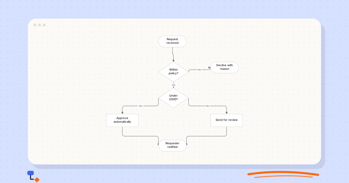
A bad flowchart is worse than no flowchart. It looks authoritative, so people trust it, and it is wrong or ambiguous in exactly the places where the process is hardest: the exceptions, the handoffs, the moments where someone has to decide. Readers come away believing they understand a process they do not.
The mistakes are remarkably consistent. The seven below cover most of what goes wrong, and each one has a quick way to spot it and a concrete fix. Throughout, we will use the same example: a first draft of an expense claim process, drawn by someone in finance who knows it well, which is the root of most of its problems.
1. Decision branches with no labels
The expense draft has a diamond reading "Receipt attached?" with two lines leaving it, one going down to "Check amount" and one going right to "Return to claimant". The author knows which is Yes. A new member of the finance team might guess correctly. They should not have to guess at all.
How to spot it
Look at every diamond and count the lines leaving it. Every one should carry a word. Pay particular attention to diamonds with three or more exits, where a missing label is easier to overlook and harder to infer. Check the lines that loop back, too: a branch that returns to an earlier step is still a branch and still needs its answer written on it.
How to fix it
Label every branch, even the obvious ones. Yes and No, or Approved and Rejected, are better than inventive alternatives because readers recognise them instantly. Where a decision has several answers, make sure they are exhaustive and cannot overlap: "Under £50", "£50 to £500" and "Over £500" leave no gaps, whereas "Small", "Medium" and "Large" invite argument.
%20scale(0.67)%20translate(0%2C0)%22%3E%3Cline%20x1%3D%22330%22%20y1%3D%2228%22%20x2%3D%22335%22%20y2%3D%22180%22%20stroke%3D%22%236b6660%22%20stroke-width%3D%221.5%22%2F%3E%3Cline%20x1%3D%22335%22%20y1%3D%22180%22%20x2%3D%22335%22%20y2%3D%22310%22%20stroke%3D%22%236b6660%22%20stroke-width%3D%221.5%22%2F%3E%3Cline%20x1%3D%22335%22%20y1%3D%22180%22%20x2%3D%22590%22%20y2%3D%22158%22%20stroke%3D%22%236b6660%22%20stroke-width%3D%221.5%22%2F%3E%3Cline%20x1%3D%22335%22%20y1%3D%22310%22%20x2%3D%2280%22%20y2%3D%22422%22%20stroke%3D%22%236b6660%22%20stroke-width%3D%221.5%22%2F%3E%3Cline%20x1%3D%22335%22%20y1%3D%22310%22%20x2%3D%22600%22%20y2%3D%22422%22%20stroke%3D%22%236b6660%22%20stroke-width%3D%221.5%22%2F%3E%3Cline%20x1%3D%2280%22%20y1%3D%22422%22%20x2%3D%22330%22%20y2%3D%22548%22%20stroke%3D%22%236b6660%22%20stroke-width%3D%221.5%22%2F%3E%3Cline%20x1%3D%22600%22%20y1%3D%22422%22%20x2%3D%22330%22%20y2%3D%22548%22%20stroke%3D%22%236b6660%22%20stroke-width%3D%221.5%22%2F%3E%3Cg%20transform%3D%22translate(260%2C0)%22%20opacity%3D%221%22%3E%3Crect%20x%3D%220%22%20y%3D%220%22%20width%3D%22140%22%20height%3D%2256%22%20rx%3D%2228%22%20fill%3D%22%23ffffff%22%20stroke%3D%22%23c8c4bd%22%20stroke-width%3D%221%22%2F%3E%3C%2Fg%3E%3Cg%20transform%3D%22translate(260%2C130)%22%20opacity%3D%221%22%3E%3Cpath%20d%3D%22M75%2C0%20L150%2C50%20L75%2C100%20L0%2C50%20Z%22%20fill%3D%22%23ffffff%22%20stroke%3D%22%23c8c4bd%22%20stroke-width%3D%221%22%2F%3E%3C%2Fg%3E%3Cg%20transform%3D%22translate(260%2C260)%22%20opacity%3D%221%22%3E%3Cpath%20d%3D%22M75%2C0%20L150%2C50%20L75%2C100%20L0%2C50%20Z%22%20fill%3D%22%23ffffff%22%20stroke%3D%22%23c8c4bd%22%20stroke-width%3D%221%22%2F%3E%3C%2Fg%3E%3Cg%20transform%3D%22translate(0%2C390)%22%20opacity%3D%221%22%3E%3Crect%20x%3D%220%22%20y%3D%220%22%20width%3D%22160%22%20height%3D%2264%22%20rx%3D%222%22%20fill%3D%22%23ffffff%22%20stroke%3D%22%23c8c4bd%22%20stroke-width%3D%221%22%2F%3E%3C%2Fg%3E%3Cg%20transform%3D%22translate(520%2C390)%22%20opacity%3D%221%22%3E%3Crect%20x%3D%220%22%20y%3D%220%22%20width%3D%22160%22%20height%3D%2264%22%20rx%3D%222%22%20fill%3D%22%23ffffff%22%20stroke%3D%22%23c8c4bd%22%20stroke-width%3D%221%22%2F%3E%3C%2Fg%3E%3Cg%20transform%3D%22translate(520%2C130)%22%20opacity%3D%221%22%3E%3Crect%20x%3D%220%22%20y%3D%220%22%20width%3D%22140%22%20height%3D%2256%22%20rx%3D%2228%22%20fill%3D%22%23ffffff%22%20stroke%3D%22%23c8c4bd%22%20stroke-width%3D%221%22%2F%3E%3C%2Fg%3E%3Cg%20transform%3D%22translate(260%2C520)%22%20opacity%3D%221%22%3E%3Crect%20x%3D%220%22%20y%3D%220%22%20width%3D%22140%22%20height%3D%2256%22%20rx%3D%2228%22%20fill%3D%22%23ffffff%22%20stroke%3D%22%23c8c4bd%22%20stroke-width%3D%221%22%2F%3E%3C%2Fg%3E%3C%2Fg%3E%3C%2Fsvg%3E)
2. Questions nobody can answer
The second diamond in the expense draft reads "Reasonable?". Two managers would answer it differently for the same claim, which means the diagram has not described a process. It has described a judgement and hidden it inside a shape that implies a rule.
How to spot it
For each decision, ask what information the person at that point would use to answer it. If the answer is "their experience" or "it depends", the question is too vague. Words like OK, appropriate, reasonable and valid are warning signs. So is a diamond holding an action, such as "Review claim", which is a step pretending to be a question.
How to fix it
Rewrite the question around the actual test: "Within the expenses policy limits?" or "Over £500?". If there genuinely is a judgement call, draw it honestly as a step, "Manager reviews claim", followed by a decision about the outcome, "Approved?". The judgement is still there, but now the diagram admits who makes it.
This mistake matters more than it looks. A vague decision in a flowchart tends to become a vague decision in the real process, applied inconsistently by whoever happens to be on duty. Forcing the question into a testable form is often the first time anyone has written the rule down.
3. Paths that go nowhere
In the draft, "Return to claimant" has no line out of it. What happens next? Does the claimant resubmit, and if so, where does the resubmission enter? Does the claim expire after a month? The diagram is silent, which usually means the process is too.
How to spot it
Find every box with no outgoing line that is not a terminator. Each one is either a missing end or a missing connection. Then look the other way: any step with no incoming line cannot be reached at all, which is often a leftover from an earlier version.
How to fix it
Follow each path until it reaches an explicit end state. "Return to claimant" should either loop back to "Claim submitted" or end at a terminator such as "Claim withdrawn". If you cannot decide which, you have found a gap in the process itself, and that is the most useful thing the diagram will tell you. Write it down and take it to whoever owns the policy.
Loops can be dead ends in disguise. If "Return to claimant" loops back to submission with no limit, the diagram describes a claim that can bounce forever. That may be true, but it is worth deciding deliberately. A loop needs a way out: a counter, a deadline or a decision that eventually routes somewhere else, such as "Resubmitted within 30 days?".
4. Only drawing the happy path
Some drafts take the opposite approach to dead ends: they simply leave out every route that is not a success. The expense process goes from submitted to checked to approved to paid in four tidy boxes. It is easy to read and of little use, because nobody needs a diagram to understand the case where everything works.
How to spot it
Count the terminators. A process with only one end almost certainly has missing failure paths. Then ask the people who do the work what goes wrong most often, and look for it on the diagram.
How to fix it
Add the exceptions that change what happens next: rejections, missing information, failed payments, retries. Draw each to its own end, and keep them visually to the side of the main path so the normal case is still easy to trace. Leave out exceptions that do not change anyone's next action; a claimant who submits on a Sunday is not a separate branch.
%20scale(0.4)%20translate(0%2C0)%22%3E%3Cline%20x1%3D%22330%22%20y1%3D%2228%22%20x2%3D%22340%22%20y2%3D%22162%22%20stroke%3D%22%236b6660%22%20stroke-width%3D%221.5%22%2F%3E%3Cline%20x1%3D%22340%22%20y1%3D%22162%22%20x2%3D%22335%22%20y2%3D%22310%22%20stroke%3D%22%236b6660%22%20stroke-width%3D%221.5%22%2F%3E%3Cline%20x1%3D%22335%22%20y1%3D%22310%22%20x2%3D%22850%22%20y2%3D%22288%22%20stroke%3D%22%236b6660%22%20stroke-width%3D%221.5%22%2F%3E%3Cline%20x1%3D%22335%22%20y1%3D%22310%22%20x2%3D%22340%22%20y2%3D%22422%22%20stroke%3D%22%236b6660%22%20stroke-width%3D%221.5%22%2F%3E%3Cline%20x1%3D%22340%22%20y1%3D%22422%22%20x2%3D%22340%22%20y2%3D%22552%22%20stroke%3D%22%236b6660%22%20stroke-width%3D%221.5%22%2F%3E%3Cline%20x1%3D%22340%22%20y1%3D%22552%22%20x2%3D%22335%22%20y2%3D%22700%22%20stroke%3D%22%236b6660%22%20stroke-width%3D%221.5%22%2F%3E%3Cline%20x1%3D%22335%22%20y1%3D%22700%22%20x2%3D%22850%22%20y2%3D%22288%22%20stroke%3D%22%236b6660%22%20stroke-width%3D%221.5%22%2F%3E%3Cline%20x1%3D%22335%22%20y1%3D%22700%22%20x2%3D%2280%22%20y2%3D%22812%22%20stroke%3D%22%236b6660%22%20stroke-width%3D%221.5%22%2F%3E%3Cline%20x1%3D%2280%22%20y1%3D%22812%22%20x2%3D%2270%22%20y2%3D%22938%22%20stroke%3D%22%236b6660%22%20stroke-width%3D%221.5%22%2F%3E%3Cg%20transform%3D%22translate(260%2C0)%22%20opacity%3D%221%22%3E%3Crect%20x%3D%220%22%20y%3D%220%22%20width%3D%22140%22%20height%3D%2256%22%20rx%3D%2228%22%20fill%3D%22%23ffffff%22%20stroke%3D%22%23c8c4bd%22%20stroke-width%3D%221%22%2F%3E%3C%2Fg%3E%3Cg%20transform%3D%22translate(260%2C130)%22%20opacity%3D%221%22%3E%3Crect%20x%3D%220%22%20y%3D%220%22%20width%3D%22160%22%20height%3D%2264%22%20rx%3D%222%22%20fill%3D%22%23ffffff%22%20stroke%3D%22%23c8c4bd%22%20stroke-width%3D%221%22%2F%3E%3C%2Fg%3E%3Cg%20transform%3D%22translate(260%2C260)%22%20opacity%3D%221%22%3E%3Cpath%20d%3D%22M75%2C0%20L150%2C50%20L75%2C100%20L0%2C50%20Z%22%20fill%3D%22%23ffffff%22%20stroke%3D%22%23c8c4bd%22%20stroke-width%3D%221%22%2F%3E%3C%2Fg%3E%3Cg%20transform%3D%22translate(780%2C260)%22%20opacity%3D%221%22%3E%3Crect%20x%3D%220%22%20y%3D%220%22%20width%3D%22140%22%20height%3D%2256%22%20rx%3D%2228%22%20fill%3D%22%23ffffff%22%20stroke%3D%22%23c8c4bd%22%20stroke-width%3D%221%22%2F%3E%3C%2Fg%3E%3Cg%20transform%3D%22translate(260%2C390)%22%20opacity%3D%221%22%3E%3Crect%20x%3D%220%22%20y%3D%220%22%20width%3D%22160%22%20height%3D%2264%22%20rx%3D%222%22%20fill%3D%22%23ffffff%22%20stroke%3D%22%23c8c4bd%22%20stroke-width%3D%221%22%2F%3E%3C%2Fg%3E%3Cg%20transform%3D%22translate(260%2C520)%22%20opacity%3D%221%22%3E%3Crect%20x%3D%220%22%20y%3D%220%22%20width%3D%22160%22%20height%3D%2264%22%20rx%3D%222%22%20fill%3D%22%23ffffff%22%20stroke%3D%22%23c8c4bd%22%20stroke-width%3D%221%22%2F%3E%3C%2Fg%3E%3Cg%20transform%3D%22translate(260%2C650)%22%20opacity%3D%221%22%3E%3Cpath%20d%3D%22M75%2C0%20L150%2C50%20L75%2C100%20L0%2C50%20Z%22%20fill%3D%22%23ffffff%22%20stroke%3D%22%23c8c4bd%22%20stroke-width%3D%221%22%2F%3E%3C%2Fg%3E%3Cg%20transform%3D%22translate(0%2C780)%22%20opacity%3D%221%22%3E%3Crect%20x%3D%220%22%20y%3D%220%22%20width%3D%22160%22%20height%3D%2264%22%20rx%3D%222%22%20fill%3D%22%23ffffff%22%20stroke%3D%22%23c8c4bd%22%20stroke-width%3D%221%22%2F%3E%3C%2Fg%3E%3Cg%20transform%3D%22translate(0%2C910)%22%20opacity%3D%221%22%3E%3Crect%20x%3D%220%22%20y%3D%220%22%20width%3D%22140%22%20height%3D%2256%22%20rx%3D%2228%22%20fill%3D%22%23ffffff%22%20stroke%3D%22%23c8c4bd%22%20stroke-width%3D%221%22%2F%3E%3C%2Fg%3E%3C%2Fg%3E%3C%2Fsvg%3E)
5. Mixing levels of detail
The expense draft has a box reading "Approve" next to a box reading "Open the finance system, search by claimant ID, match receipt total to claim line, and flag mismatches in column F". One is a summary of a manager's decision; the other is a set of keystrokes. The diagram cannot decide what it is for.
How to spot it
Look for labels that are much longer than their neighbours, labels that mention screens, fields or buttons, and boxes that would take very different amounts of time. Ask whether each box could reasonably be one person's single piece of work.
How to fix it
Choose one altitude and rewrite every box at that height. The keystroke-level box becomes "Match receipt to claim". If the detail matters, put it in a separate diagram or a written procedure and reference it, rather than inflating one step until it dominates the chart.
The opposite slip happens too: a box so high-level it hides the process. "Finance processes claim" might cover six steps and two decisions. If the people reading the diagram need to know what happens inside that box, it needs opening up.
6. Flow that wanders and lines that tangle
The draft starts at the top left, runs down, then turns right because the page ran out, then comes back up to reach the approval step that was added later. Three lines cross in the middle. The process is not complicated; the drawing is.
How to spot it
Trace the main path. If your finger changes direction more than once, or if you cannot tell at a glance which way an arrow is going, the layout is working against the reader. Count crossings: one or two may be unavoidable, but a cluster of them means steps that interact are drawn far apart.
How to fix it
Pick a direction, top to bottom or left to right, and make every forward line follow it. Keep backward lines for genuine loops, so they stand out. Put the common case on a straight spine and move exceptions to the sides. Running an automatic layout is a good first pass; adjusting by hand afterwards usually produces the clearest result.
Late additions cause most of this. When a step is added after the first draft, it gets squeezed into whatever space is free, and the lines bend to reach it. After any significant edit, step back and look at the whole chart again rather than only at the part you changed. Re-laying it out from scratch takes a minute and often removes crossings that had built up over several revisions.
7. One diagram doing the work of three
The final version of the expense draft also covers corporate card reconciliation, mileage claims and the monthly payroll run, because they all involve expenses. It now has forty boxes, two start points and lines that leave the page. Nobody reads it end to end, which defeats the purpose.
How to spot it
More than one genuine start event is the clearest sign. So is a chart that cannot be read at one screen's zoom, or a section with its own owner, trigger and failure modes that only connects to the rest at one point. Off-page connectors are often a symptom: the author has noticed the diagram is too big and is working around it.
How to fix it
Split it. Each process gets its own diagram with its own name, and where one hands off to another, show that as a single step, "Add to payroll run", that points to the other diagram. If the real story is who does what across departments, consider a swimlane diagram instead, where handoffs become visible as lines crossing lanes.
%20scale(0.55)%20translate(0%2C0)%22%3E%3Cline%20x1%3D%22330%22%20y1%3D%2228%22%20x2%3D%22335%22%20y2%3D%22180%22%20stroke%3D%22%236b6660%22%20stroke-width%3D%221.5%22%2F%3E%3Cline%20x1%3D%22335%22%20y1%3D%22180%22%20x2%3D%2270%22%20y2%3D%22158%22%20stroke%3D%22%236b6660%22%20stroke-width%3D%221.5%22%2F%3E%3Cline%20x1%3D%22335%22%20y1%3D%22180%22%20x2%3D%22335%22%20y2%3D%22310%22%20stroke%3D%22%236b6660%22%20stroke-width%3D%221.5%22%2F%3E%3Cline%20x1%3D%22335%22%20y1%3D%22310%22%20x2%3D%2280%22%20y2%3D%22422%22%20stroke%3D%22%236b6660%22%20stroke-width%3D%221.5%22%2F%3E%3Cline%20x1%3D%22335%22%20y1%3D%22310%22%20x2%3D%22600%22%20y2%3D%22422%22%20stroke%3D%22%236b6660%22%20stroke-width%3D%221.5%22%2F%3E%3Cline%20x1%3D%2280%22%20y1%3D%22422%22%20x2%3D%22340%22%20y2%3D%22552%22%20stroke%3D%22%236b6660%22%20stroke-width%3D%221.5%22%2F%3E%3Cline%20x1%3D%22600%22%20y1%3D%22422%22%20x2%3D%22340%22%20y2%3D%22552%22%20stroke%3D%22%236b6660%22%20stroke-width%3D%221.5%22%2F%3E%3Cline%20x1%3D%22340%22%20y1%3D%22552%22%20x2%3D%22330%22%20y2%3D%22678%22%20stroke%3D%22%236b6660%22%20stroke-width%3D%221.5%22%2F%3E%3Cg%20transform%3D%22translate(260%2C0)%22%20opacity%3D%221%22%3E%3Crect%20x%3D%220%22%20y%3D%220%22%20width%3D%22140%22%20height%3D%2256%22%20rx%3D%2228%22%20fill%3D%22%23ffffff%22%20stroke%3D%22%23c8c4bd%22%20stroke-width%3D%221%22%2F%3E%3C%2Fg%3E%3Cg%20transform%3D%22translate(260%2C130)%22%20opacity%3D%221%22%3E%3Cpath%20d%3D%22M75%2C0%20L150%2C50%20L75%2C100%20L0%2C50%20Z%22%20fill%3D%22%23ffffff%22%20stroke%3D%22%23c8c4bd%22%20stroke-width%3D%221%22%2F%3E%3C%2Fg%3E%3Cg%20transform%3D%22translate(0%2C130)%22%20opacity%3D%221%22%3E%3Crect%20x%3D%220%22%20y%3D%220%22%20width%3D%22140%22%20height%3D%2256%22%20rx%3D%2228%22%20fill%3D%22%23ffffff%22%20stroke%3D%22%23c8c4bd%22%20stroke-width%3D%221%22%2F%3E%3C%2Fg%3E%3Cg%20transform%3D%22translate(260%2C260)%22%20opacity%3D%221%22%3E%3Cpath%20d%3D%22M75%2C0%20L150%2C50%20L75%2C100%20L0%2C50%20Z%22%20fill%3D%22%23ffffff%22%20stroke%3D%22%23c8c4bd%22%20stroke-width%3D%221%22%2F%3E%3C%2Fg%3E%3Cg%20transform%3D%22translate(0%2C390)%22%20opacity%3D%221%22%3E%3Crect%20x%3D%220%22%20y%3D%220%22%20width%3D%22160%22%20height%3D%2264%22%20rx%3D%222%22%20fill%3D%22%23ffffff%22%20stroke%3D%22%23c8c4bd%22%20stroke-width%3D%221%22%2F%3E%3C%2Fg%3E%3Cg%20transform%3D%22translate(520%2C390)%22%20opacity%3D%221%22%3E%3Crect%20x%3D%220%22%20y%3D%220%22%20width%3D%22160%22%20height%3D%2264%22%20rx%3D%222%22%20fill%3D%22%23ffffff%22%20stroke%3D%22%23c8c4bd%22%20stroke-width%3D%221%22%2F%3E%3C%2Fg%3E%3Cg%20transform%3D%22translate(260%2C520)%22%20opacity%3D%221%22%3E%3Crect%20x%3D%220%22%20y%3D%220%22%20width%3D%22160%22%20height%3D%2264%22%20rx%3D%222%22%20fill%3D%22%23ffffff%22%20stroke%3D%22%23c8c4bd%22%20stroke-width%3D%221%22%2F%3E%3C%2Fg%3E%3Cg%20transform%3D%22translate(260%2C650)%22%20opacity%3D%221%22%3E%3Crect%20x%3D%220%22%20y%3D%220%22%20width%3D%22140%22%20height%3D%2256%22%20rx%3D%2228%22%20fill%3D%22%23ffffff%22%20stroke%3D%22%23c8c4bd%22%20stroke-width%3D%221%22%2F%3E%3C%2Fg%3E%3C%2Fg%3E%3C%2Fsvg%3E)
A checklist before you share
Run through this on any flowchart before it goes into a document, a wiki or a meeting. Most checks take seconds, and the ones that take longer are usually finding a real gap in the process.
| Mistake | Quick check | Fix |
|---|---|---|
| Unlabelled branches | Does every line out of a diamond carry a word? | Label it; make multi-way answers exclusive |
| Unanswerable questions | Could two people answer it differently? | Name the test and threshold, or draw the judgement as a step |
| Dead ends | Does every non-terminator box have a line out? | Follow each path to an explicit end |
| Happy path only | Is there more than one end? | Add the exceptions that change what happens next |
| Mixed detail | Could each box be one person's piece of work? | Rewrite at one altitude; move detail elsewhere |
| Wandering flow | Does the main path change direction? | One direction, straight spine, backward lines only for loops |
| Too much in one | Is there more than one start event? | Split into named diagrams that reference each other |
Some of this can be checked for you. In DiagramDock, the flowchart suggestions panel flags unlabelled decision branches and steps that cannot be reached from the start. It is advisory and never changes the diagram, so you decide what to fix. One-click Yes, No, Approved and Rejected labels make the first mistake quick to correct, and "Arrange diagram" will lay out a tangled chart top to bottom or left to right when you ask, with a single undo if you preferred it before.
The checks a tool cannot do are the important ones: whether a question is answerable, whether an exception matters, whether the boxes sit at one altitude. For those, hand the diagram to someone who was not in the room and listen to where they hesitate.
Questions
- What is the most common flowchart mistake?
- Unlabelled branches out of a decision. The author knows which line means Yes, so the omission is invisible to them, and every other reader has to guess.
- How do I check a flowchart for errors quickly?
- Trace every path from the start with your finger. Each one should reach an explicit end, pass only through labelled branches and never stop at a box with no way out. Then ask someone outside the team to talk through it.
- Should a flowchart show exceptions or only the normal process?
- Show the exceptions that change what happens next: rejections, failures, retries. Leave out anything that would not change anyone's decision. A flowchart showing only the happy path describes the process you hope for, not the one you run.
- When should one flowchart become two?
- When part of it has its own trigger, its own owner or its own failure modes, or when you can no longer read it at one screen's zoom. Give each diagram a name and refer to one from the other.
Keep reading
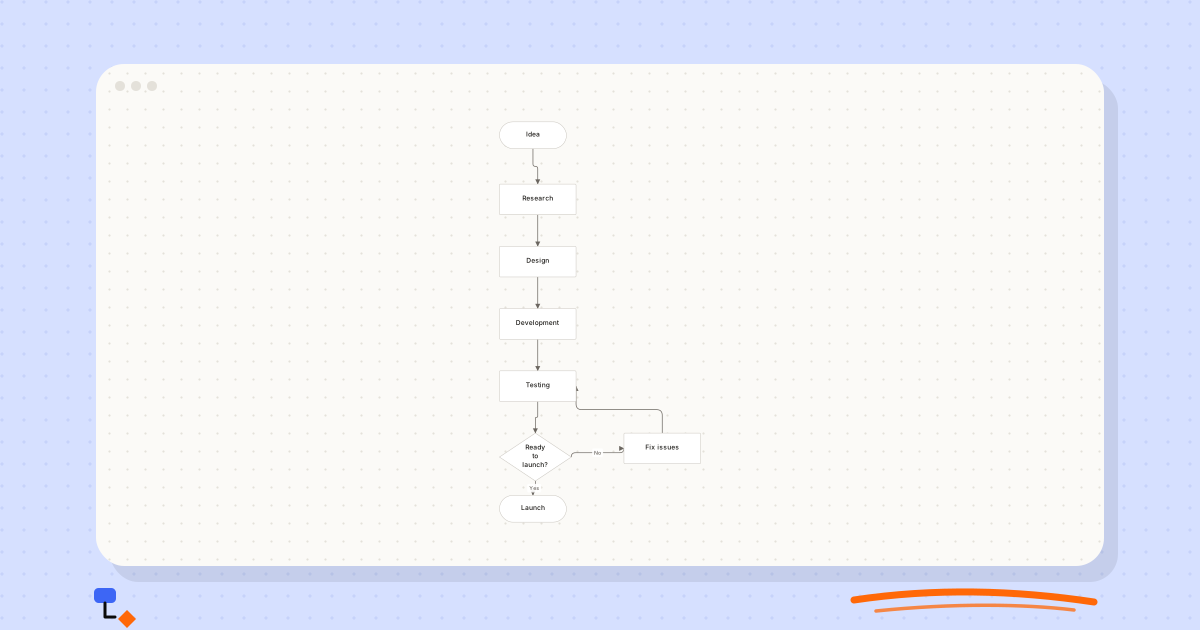
Flowcharts9 min read
What makes a flowchart easy to read?
Direction, a visible main path, consistent detail, honest labels and loops that read as loops: what lets someone follow your flowchart without a meeting.
Flowcharts11 min read
Flowchart symbols explained without the jargon
What each flowchart shape means, the four you need for almost every diagram, when the specialised ones earn their place, and how shapes get misused.
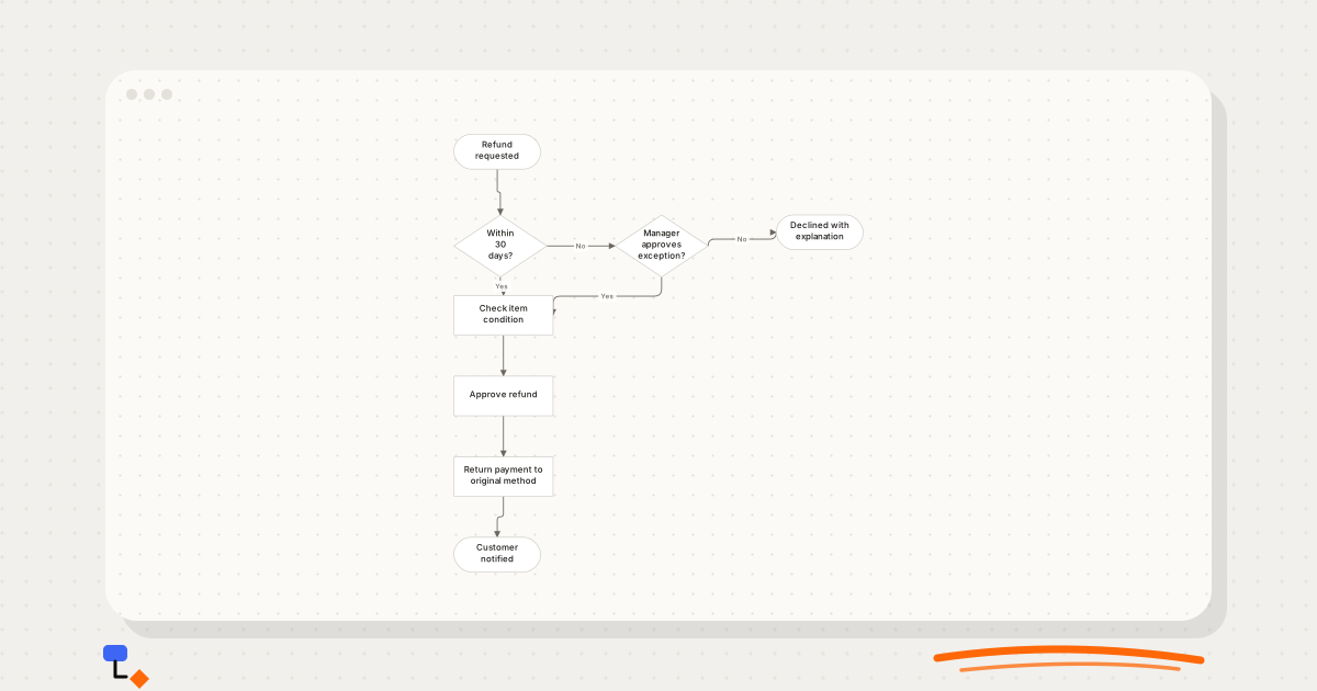
Diagramming9 min read
Decision trees vs flowcharts: which one fits the problem?
Trees branch and never rejoin; flowcharts loop and merge. How that one structural difference decides which diagram to draw, with a refund policy drawn both ways.
Business processes10 min read
The case for drawing a process before trying to fix it
Why as-is mapping comes before improvement, how to run a mapping session, and where handoffs, waits, rework loops and approval chains show up on the page.