Customer journey maps: what the rows and columns actually mean
What each stage and row of a customer journey map is for, how to fill it from evidence rather than guesswork, and a worked example for a software trial.
The DiagramDock team · · 9 min read
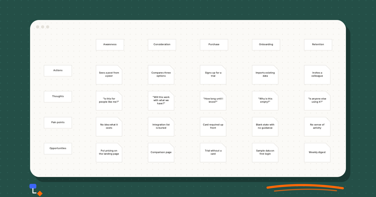
A customer journey map is a grid. Columns run left to right through the stages a customer passes through; rows run down through the kinds of thing you want to know at each stage. The format is simple enough that most teams can produce one in an afternoon, and that is part of the problem. A grid with every cell filled in looks finished whether or not anything in it is true.
The value of a journey map depends entirely on what goes in the cells. Understanding what each row and column is meant to capture, and where the content should come from, is the difference between a map that changes decisions and a poster that decorates a meeting room.
The shape of the grid
The columns are stages of time. A customer moves through them in order, though not always forwards; people drop back from Purchase to Consideration all the time. The rows are layers of description. Each row asks the same question of every stage, so reading along a row shows how one aspect of the experience changes over the journey, and reading down a column gives a full picture of one moment.
Both directions matter. Reading down tells you what a customer is going through at, say, Onboarding. Reading across the Pain points row tells you whether frustration builds steadily or arrives all at once. The map is designed to be read both ways, and a good one rewards both.
%20scale(0.44)%20translate(0%2C0)%22%3E%3Cg%20transform%3D%22translate(300%2C0)%22%20opacity%3D%221%22%3E%3Crect%20x%3D%220%22%20y%3D%220%22%20width%3D%22160%22%20height%3D%2264%22%20rx%3D%220%22%20fill%3D%22%23ffffff%22%20stroke%3D%22%23c8c4bd%22%20stroke-width%3D%221%22%2F%3E%3C%2Fg%3E%3Cg%20transform%3D%22translate(600%2C0)%22%20opacity%3D%221%22%3E%3Crect%20x%3D%220%22%20y%3D%220%22%20width%3D%22160%22%20height%3D%2264%22%20rx%3D%220%22%20fill%3D%22%23ffffff%22%20stroke%3D%22%23c8c4bd%22%20stroke-width%3D%221%22%2F%3E%3C%2Fg%3E%3Cg%20transform%3D%22translate(900%2C0)%22%20opacity%3D%221%22%3E%3Crect%20x%3D%220%22%20y%3D%220%22%20width%3D%22160%22%20height%3D%2264%22%20rx%3D%220%22%20fill%3D%22%23ffffff%22%20stroke%3D%22%23c8c4bd%22%20stroke-width%3D%221%22%2F%3E%3C%2Fg%3E%3Cg%20transform%3D%22translate(1200%2C0)%22%20opacity%3D%221%22%3E%3Crect%20x%3D%220%22%20y%3D%220%22%20width%3D%22160%22%20height%3D%2264%22%20rx%3D%220%22%20fill%3D%22%23ffffff%22%20stroke%3D%22%23c8c4bd%22%20stroke-width%3D%221%22%2F%3E%3C%2Fg%3E%3Cg%20transform%3D%22translate(1500%2C0)%22%20opacity%3D%221%22%3E%3Crect%20x%3D%220%22%20y%3D%220%22%20width%3D%22160%22%20height%3D%2264%22%20rx%3D%220%22%20fill%3D%22%23ffffff%22%20stroke%3D%22%23c8c4bd%22%20stroke-width%3D%221%22%2F%3E%3C%2Fg%3E%3Cg%20transform%3D%22translate(0%2C150)%22%20opacity%3D%221%22%3E%3Crect%20x%3D%220%22%20y%3D%220%22%20width%3D%22160%22%20height%3D%2264%22%20rx%3D%220%22%20fill%3D%22%23ffffff%22%20stroke%3D%22%23c8c4bd%22%20stroke-width%3D%221%22%2F%3E%3C%2Fg%3E%3Cg%20transform%3D%22translate(0%2C300)%22%20opacity%3D%221%22%3E%3Crect%20x%3D%220%22%20y%3D%220%22%20width%3D%22160%22%20height%3D%2264%22%20rx%3D%220%22%20fill%3D%22%23ffffff%22%20stroke%3D%22%23c8c4bd%22%20stroke-width%3D%221%22%2F%3E%3C%2Fg%3E%3Cg%20transform%3D%22translate(0%2C450)%22%20opacity%3D%221%22%3E%3Crect%20x%3D%220%22%20y%3D%220%22%20width%3D%22160%22%20height%3D%2264%22%20rx%3D%220%22%20fill%3D%22%23ffffff%22%20stroke%3D%22%23c8c4bd%22%20stroke-width%3D%221%22%2F%3E%3C%2Fg%3E%3Cg%20transform%3D%22translate(0%2C600)%22%20opacity%3D%221%22%3E%3Crect%20x%3D%220%22%20y%3D%220%22%20width%3D%22160%22%20height%3D%2264%22%20rx%3D%220%22%20fill%3D%22%23ffffff%22%20stroke%3D%22%23c8c4bd%22%20stroke-width%3D%221%22%2F%3E%3C%2Fg%3E%3Cg%20transform%3D%22translate(300%2C150)%22%20opacity%3D%221%22%3E%3Cpath%20d%3D%22M0%2C0%20L123.6%2C0%20L150%2C26.4%20L150%2C110%20L0%2C110%20Z%22%20fill%3D%22%23ffffff%22%20stroke%3D%22%23c8c4bd%22%20stroke-width%3D%221%22%2F%3E%3C%2Fg%3E%3Cg%20transform%3D%22translate(300%2C300)%22%20opacity%3D%221%22%3E%3Cpath%20d%3D%22M0%2C0%20L123.6%2C0%20L150%2C26.4%20L150%2C110%20L0%2C110%20Z%22%20fill%3D%22%23ffffff%22%20stroke%3D%22%23c8c4bd%22%20stroke-width%3D%221%22%2F%3E%3C%2Fg%3E%3Cg%20transform%3D%22translate(300%2C450)%22%20opacity%3D%221%22%3E%3Cpath%20d%3D%22M0%2C0%20L123.6%2C0%20L150%2C26.4%20L150%2C110%20L0%2C110%20Z%22%20fill%3D%22%23ffffff%22%20stroke%3D%22%23c8c4bd%22%20stroke-width%3D%221%22%2F%3E%3C%2Fg%3E%3Cg%20transform%3D%22translate(300%2C600)%22%20opacity%3D%221%22%3E%3Cpath%20d%3D%22M0%2C0%20L123.6%2C0%20L150%2C26.4%20L150%2C110%20L0%2C110%20Z%22%20fill%3D%22%23ffffff%22%20stroke%3D%22%23c8c4bd%22%20stroke-width%3D%221%22%2F%3E%3C%2Fg%3E%3Cg%20transform%3D%22translate(600%2C150)%22%20opacity%3D%221%22%3E%3Cpath%20d%3D%22M0%2C0%20L123.6%2C0%20L150%2C26.4%20L150%2C110%20L0%2C110%20Z%22%20fill%3D%22%23ffffff%22%20stroke%3D%22%23c8c4bd%22%20stroke-width%3D%221%22%2F%3E%3C%2Fg%3E%3Cg%20transform%3D%22translate(600%2C300)%22%20opacity%3D%221%22%3E%3Cpath%20d%3D%22M0%2C0%20L123.6%2C0%20L150%2C26.4%20L150%2C110%20L0%2C110%20Z%22%20fill%3D%22%23ffffff%22%20stroke%3D%22%23c8c4bd%22%20stroke-width%3D%221%22%2F%3E%3C%2Fg%3E%3Cg%20transform%3D%22translate(600%2C450)%22%20opacity%3D%221%22%3E%3Cpath%20d%3D%22M0%2C0%20L123.6%2C0%20L150%2C26.4%20L150%2C110%20L0%2C110%20Z%22%20fill%3D%22%23ffffff%22%20stroke%3D%22%23c8c4bd%22%20stroke-width%3D%221%22%2F%3E%3C%2Fg%3E%3Cg%20transform%3D%22translate(600%2C600)%22%20opacity%3D%221%22%3E%3Cpath%20d%3D%22M0%2C0%20L123.6%2C0%20L150%2C26.4%20L150%2C110%20L0%2C110%20Z%22%20fill%3D%22%23ffffff%22%20stroke%3D%22%23c8c4bd%22%20stroke-width%3D%221%22%2F%3E%3C%2Fg%3E%3Cg%20transform%3D%22translate(900%2C150)%22%20opacity%3D%221%22%3E%3Cpath%20d%3D%22M0%2C0%20L123.6%2C0%20L150%2C26.4%20L150%2C110%20L0%2C110%20Z%22%20fill%3D%22%23ffffff%22%20stroke%3D%22%23c8c4bd%22%20stroke-width%3D%221%22%2F%3E%3C%2Fg%3E%3Cg%20transform%3D%22translate(900%2C300)%22%20opacity%3D%221%22%3E%3Cpath%20d%3D%22M0%2C0%20L123.6%2C0%20L150%2C26.4%20L150%2C110%20L0%2C110%20Z%22%20fill%3D%22%23ffffff%22%20stroke%3D%22%23c8c4bd%22%20stroke-width%3D%221%22%2F%3E%3C%2Fg%3E%3Cg%20transform%3D%22translate(900%2C450)%22%20opacity%3D%221%22%3E%3Cpath%20d%3D%22M0%2C0%20L123.6%2C0%20L150%2C26.4%20L150%2C110%20L0%2C110%20Z%22%20fill%3D%22%23ffffff%22%20stroke%3D%22%23c8c4bd%22%20stroke-width%3D%221%22%2F%3E%3C%2Fg%3E%3Cg%20transform%3D%22translate(900%2C600)%22%20opacity%3D%221%22%3E%3Cpath%20d%3D%22M0%2C0%20L123.6%2C0%20L150%2C26.4%20L150%2C110%20L0%2C110%20Z%22%20fill%3D%22%23ffffff%22%20stroke%3D%22%23c8c4bd%22%20stroke-width%3D%221%22%2F%3E%3C%2Fg%3E%3Cg%20transform%3D%22translate(1200%2C150)%22%20opacity%3D%221%22%3E%3Cpath%20d%3D%22M0%2C0%20L123.6%2C0%20L150%2C26.4%20L150%2C110%20L0%2C110%20Z%22%20fill%3D%22%23ffffff%22%20stroke%3D%22%23c8c4bd%22%20stroke-width%3D%221%22%2F%3E%3C%2Fg%3E%3Cg%20transform%3D%22translate(1200%2C300)%22%20opacity%3D%221%22%3E%3Cpath%20d%3D%22M0%2C0%20L123.6%2C0%20L150%2C26.4%20L150%2C110%20L0%2C110%20Z%22%20fill%3D%22%23ffffff%22%20stroke%3D%22%23c8c4bd%22%20stroke-width%3D%221%22%2F%3E%3C%2Fg%3E%3Cg%20transform%3D%22translate(1200%2C450)%22%20opacity%3D%221%22%3E%3Cpath%20d%3D%22M0%2C0%20L123.6%2C0%20L150%2C26.4%20L150%2C110%20L0%2C110%20Z%22%20fill%3D%22%23ffffff%22%20stroke%3D%22%23c8c4bd%22%20stroke-width%3D%221%22%2F%3E%3C%2Fg%3E%3Cg%20transform%3D%22translate(1200%2C600)%22%20opacity%3D%221%22%3E%3Cpath%20d%3D%22M0%2C0%20L123.6%2C0%20L150%2C26.4%20L150%2C110%20L0%2C110%20Z%22%20fill%3D%22%23ffffff%22%20stroke%3D%22%23c8c4bd%22%20stroke-width%3D%221%22%2F%3E%3C%2Fg%3E%3Cg%20transform%3D%22translate(1500%2C150)%22%20opacity%3D%221%22%3E%3Cpath%20d%3D%22M0%2C0%20L123.6%2C0%20L150%2C26.4%20L150%2C110%20L0%2C110%20Z%22%20fill%3D%22%23ffffff%22%20stroke%3D%22%23c8c4bd%22%20stroke-width%3D%221%22%2F%3E%3C%2Fg%3E%3Cg%20transform%3D%22translate(1500%2C300)%22%20opacity%3D%221%22%3E%3Cpath%20d%3D%22M0%2C0%20L123.6%2C0%20L150%2C26.4%20L150%2C110%20L0%2C110%20Z%22%20fill%3D%22%23ffffff%22%20stroke%3D%22%23c8c4bd%22%20stroke-width%3D%221%22%2F%3E%3C%2Fg%3E%3Cg%20transform%3D%22translate(1500%2C450)%22%20opacity%3D%221%22%3E%3Cpath%20d%3D%22M0%2C0%20L123.6%2C0%20L150%2C26.4%20L150%2C110%20L0%2C110%20Z%22%20fill%3D%22%23ffffff%22%20stroke%3D%22%23c8c4bd%22%20stroke-width%3D%221%22%2F%3E%3C%2Fg%3E%3Cg%20transform%3D%22translate(1500%2C600)%22%20opacity%3D%221%22%3E%3Cpath%20d%3D%22M0%2C0%20L123.6%2C0%20L150%2C26.4%20L150%2C110%20L0%2C110%20Z%22%20fill%3D%22%23ffffff%22%20stroke%3D%22%23c8c4bd%22%20stroke-width%3D%221%22%2F%3E%3C%2Fg%3E%3C%2Fg%3E%3C%2Fsvg%3E)
The template above uses four rows. The fuller version described below adds Questions and Touchpoints, which are worth including when the map is meant to guide content or support work rather than only product decisions.
The columns: five stages
| Stage | Starts when | Ends when | What you most need to learn |
|---|---|---|---|
| Awareness | The customer first encounters you | They decide you are worth a closer look | Where they heard of you and what they assumed |
| Consideration | They start actively evaluating | They choose to commit or walk away | What they compare you with and what decides it |
| Purchase | They begin to sign up or buy | They have paid or started a trial | What friction appears at the moment of commitment |
| Onboarding | They first use the product | They get the value they came for | How long that takes and where they stall |
| Retention | The product is part of their routine | They renew, expand or leave | What keeps them and what makes them reconsider |
The boundaries are the part teams most often skip. Write down what event starts and ends each stage for your customers. For a software trial, Purchase might end when the trial account is created; for a subscription box, when the first payment clears. Without defined boundaries, two people filling in the same column will be describing different moments.
Five stages is a convention, not a rule. A business with a long sales cycle might split Consideration into research and evaluation. A product used once might have no meaningful Retention stage and need a Referral stage instead. Change the columns to fit the journey rather than forcing the journey into the columns.
The rows: six layers
Actions
What the customer actually does: reads a post, opens a pricing page, books a call, imports a file. Write each action as a verb. This row is the backbone of the map, and it is the one most easily checked against evidence, because many actions leave a trace in analytics or logs.
Thoughts
What the customer is thinking or feeling at that point, written in their words where possible. "Is this for people like me?" is more useful than "uncertain". Thoughts explain why an action happens or fails to happen, which actions alone cannot do.
Questions
The specific information the customer needs before they can move on. Questions differ from thoughts in that they have answers you could provide. "How much does it cost for ten people?" is a question. "This feels expensive" is a thought. The Questions row is the one content and support teams find most directly useful, because each cell is a gap in what you tell people.
Touchpoints
Where the interaction happens: a search result, the website, a sales email, the product itself, an invoice, a support chat. Touchpoints connect the journey to the parts of the organisation that own each channel, which is what makes the map actionable later.
Pain points
What goes wrong or causes friction. Be specific: "Integration list is buried three clicks deep" rather than "Hard to find information". A pain point should be concrete enough that someone could look at it and agree or disagree with it.
Opportunities
What you could do about it. Each opportunity should answer a pain point or a question in the same column. An opportunity with no corresponding problem above it is a feature idea that has wandered onto the map, and it should be challenged.
A quick consistency check: every cell in Opportunities should point at something above it in the same column. If you cannot draw that line, either the evidence is missing or the opportunity does not belong.
Filling it from evidence, not imagination
The easiest way to produce a journey map is to gather the team and fill in the cells from what everyone believes. The result reflects the organisation's assumptions back at it, and assumptions are precisely what a journey map is supposed to test.
Better sources, roughly in order of how directly they reflect the customer's experience:
- Watching people use the product or website, ideally while thinking aloud. This is the best source for Actions, Thoughts and Pain points.
- Customer interviews, especially with recent sign-ups and recent cancellations. Ask about specific occasions rather than general opinions.
- Support tickets and chat logs, grouped by stage. These are a direct record of Questions and Pain points.
- Sales call notes and lost-deal reasons, for Consideration and Purchase.
- Product analytics for Actions: where people go, where they stop, how long each stage takes.
- Cancellation or churn reasons, for Retention.
Mark the source of each cell, even informally. A small tag such as "interviews", "tickets" or "assumption" lets readers judge how much weight to give it. Cells marked as assumptions are not wrong to include. They are the map's list of things to go and find out.
Resist filling every cell. An empty cell that says "we don't know what people think at this point" is more honest and more useful than a plausible guess. It also tells you where the next round of research should go.
Worked example: a software trial
Consider a small software company offering a project tool with a free trial. The team gathers evidence over a few weeks: they read through recent support tickets by stage, interview a handful of people who signed up and a handful who did not convert, and watch three new users go through first login. The resulting map, in summary:
| Awareness | Consideration | Purchase | Onboarding | Retention | |
|---|---|---|---|---|---|
| Actions | Sees a post shared by a peer | Compares three options side by side | Signs up for a trial | Imports existing data | Invites a colleague |
| Thoughts | "Is this for people like me?" | "Will this work with what we have?" | "How long until I know?" | "Why is this empty?" | "Is anyone else using it?" |
| Questions | What does it cost? | Does it connect to our current tools? | Do I need a card? | Where do I start? | Can I see what my team has done? |
| Touchpoints | Social post, landing page | Website, comparison articles | Signup form | Product, welcome email | Product, email |
| Pain points | No pricing visible | Integration list is buried | Card required up front | Blank state with no guidance | No sense of team activity |
| Opportunities | Put pricing on the landing page | A clear comparison page | Trial without a card | Sample data on first login | A weekly digest |
Reading down the Onboarding column gives one complete moment: the customer imports their data, sees an empty screen, does not know where to start, and nothing in the product or the welcome email tells them. Reading across the Questions row shows something different: at almost every stage, the customer is asking for information the company has but does not show. That pattern is invisible in any single column.
The team then ranks the opportunities. Sample data on first login and the card requirement both affect the step between trying the product and getting value from it, so they come first. The weekly digest is promising but rests on a pain point that came from only two interviews, so it is marked for more research before anyone builds it.
How a journey map relates to a process map
A journey map is drawn from the outside in. It describes what the customer does and feels, and it deliberately ignores how the organisation is arranged. A process map is drawn from the inside out. It describes what the organisation does, in what order and who owns each step, and the customer appears only where they trigger or receive something.
The two describe the same moments from opposite sides, which is why they work best together. A pain point on the journey map usually has a cause in the process map: a handoff that is slow, a stage nobody owns, an approval that sits in a queue. A journey map tells you where it hurts. A process map tells you why.
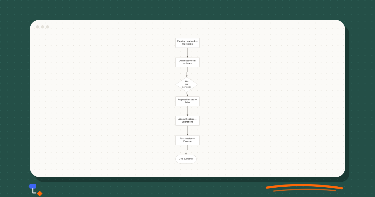
%20scale(0.46)%20translate(-260%2C0)%22%3E%3Cline%20x1%3D%22340%22%20y1%3D%2232%22%20x2%3D%22340%22%20y2%3D%22162%22%20stroke%3D%22%236b6660%22%20stroke-width%3D%221.5%22%2F%3E%3Cline%20x1%3D%22340%22%20y1%3D%22162%22%20x2%3D%22335%22%20y2%3D%22310%22%20stroke%3D%22%236b6660%22%20stroke-width%3D%221.5%22%2F%3E%3Cline%20x1%3D%22335%22%20y1%3D%22310%22%20x2%3D%22340%22%20y2%3D%22422%22%20stroke%3D%22%236b6660%22%20stroke-width%3D%221.5%22%2F%3E%3Cline%20x1%3D%22340%22%20y1%3D%22422%22%20x2%3D%22340%22%20y2%3D%22552%22%20stroke%3D%22%236b6660%22%20stroke-width%3D%221.5%22%2F%3E%3Cline%20x1%3D%22340%22%20y1%3D%22552%22%20x2%3D%22340%22%20y2%3D%22682%22%20stroke%3D%22%236b6660%22%20stroke-width%3D%221.5%22%2F%3E%3Cline%20x1%3D%22340%22%20y1%3D%22682%22%20x2%3D%22330%22%20y2%3D%22808%22%20stroke%3D%22%236b6660%22%20stroke-width%3D%221.5%22%2F%3E%3Cg%20transform%3D%22translate(260%2C0)%22%20opacity%3D%221%22%3E%3Crect%20x%3D%220%22%20y%3D%220%22%20width%3D%22160%22%20height%3D%2264%22%20rx%3D%222%22%20fill%3D%22%23ffffff%22%20stroke%3D%22%23c8c4bd%22%20stroke-width%3D%221%22%2F%3E%3C%2Fg%3E%3Cg%20transform%3D%22translate(260%2C130)%22%20opacity%3D%221%22%3E%3Crect%20x%3D%220%22%20y%3D%220%22%20width%3D%22160%22%20height%3D%2264%22%20rx%3D%222%22%20fill%3D%22%23ffffff%22%20stroke%3D%22%23c8c4bd%22%20stroke-width%3D%221%22%2F%3E%3C%2Fg%3E%3Cg%20transform%3D%22translate(260%2C260)%22%20opacity%3D%221%22%3E%3Cpath%20d%3D%22M75%2C0%20L150%2C50%20L75%2C100%20L0%2C50%20Z%22%20fill%3D%22%23ffffff%22%20stroke%3D%22%23c8c4bd%22%20stroke-width%3D%221%22%2F%3E%3C%2Fg%3E%3Cg%20transform%3D%22translate(260%2C390)%22%20opacity%3D%221%22%3E%3Crect%20x%3D%220%22%20y%3D%220%22%20width%3D%22160%22%20height%3D%2264%22%20rx%3D%222%22%20fill%3D%22%23ffffff%22%20stroke%3D%22%23c8c4bd%22%20stroke-width%3D%221%22%2F%3E%3C%2Fg%3E%3Cg%20transform%3D%22translate(260%2C520)%22%20opacity%3D%221%22%3E%3Crect%20x%3D%220%22%20y%3D%220%22%20width%3D%22160%22%20height%3D%2264%22%20rx%3D%222%22%20fill%3D%22%23ffffff%22%20stroke%3D%22%23c8c4bd%22%20stroke-width%3D%221%22%2F%3E%3C%2Fg%3E%3Cg%20transform%3D%22translate(260%2C650)%22%20opacity%3D%221%22%3E%3Crect%20x%3D%220%22%20y%3D%220%22%20width%3D%22160%22%20height%3D%2264%22%20rx%3D%222%22%20fill%3D%22%23ffffff%22%20stroke%3D%22%23c8c4bd%22%20stroke-width%3D%221%22%2F%3E%3C%2Fg%3E%3Cg%20transform%3D%22translate(260%2C780)%22%20opacity%3D%221%22%3E%3Crect%20x%3D%220%22%20y%3D%220%22%20width%3D%22140%22%20height%3D%2256%22%20rx%3D%2228%22%20fill%3D%22%23ffffff%22%20stroke%3D%22%23c8c4bd%22%20stroke-width%3D%221%22%2F%3E%3C%2Fg%3E%3C%2Fg%3E%3C%2Fsvg%3E)
A practical way to connect them is to put the journey map's columns above a process map or swimlane diagram drawn on the same time axis. When the customer is in Purchase, which teams are acting? When the customer's thought is "How long until I know?", which internal step are they waiting on? Gaps where the customer is waiting and no internal step is happening are often where the experience breaks down.
Common mistakes
- Mapping an average customer who does not exist. Pick one type of customer with one goal.
- Filling cells from workshop opinion without marking them as assumptions.
- Writing pain points as categories ("usability") rather than observable problems.
- Listing opportunities that answer no pain point or question on the map.
- Treating the five standard stages as fixed when your customers' journey has a different shape.
- Producing the map and never revisiting it. Journeys change when the product does; date the map and review it after significant changes.
Building a journey map in DiagramDock
DiagramDock has a customer journey diagram type, and its customer journey template is a filled-in software trial map with five stages and four layers, intended to be overwritten with your own evidence rather than used as a blank grid. The process map and user flow types sit alongside it, so the organisation's side of the journey and the screen-by-screen path can be drawn with the palettes suited to each.
Local notes can be attached to elements, which is a convenient place to record where each cell's content came from, and they can be included or excluded when you export. Everything is stored in your browser, so a map built from interview notes stays on your own machine.
Questions
- What are the stages of a customer journey map?
- A common set is Awareness, Consideration, Purchase, Onboarding and Retention. They are a convention rather than a standard; rename or split them to match how your customers actually move from first hearing about you to staying.
- What rows should a customer journey map have?
- Useful rows include Actions, Thoughts, Questions, Touchpoints, Pain points and Opportunities. Actions and Pain points are the most important. Add or drop rows depending on what decisions the map needs to support, but keep every row grounded in evidence.
- How is a customer journey map different from a process map?
- A journey map describes what the customer does, thinks and experiences. A process map describes what your organisation does and who does it. They describe the same moments from opposite sides, and the most useful insights come from putting the two next to each other.
- Where does the information for a journey map come from?
- From customer interviews, support tickets, sales call notes, product analytics, cancellation reasons and watching people use the product. Team assumptions are a starting hypothesis, and should be marked as such until evidence confirms them.
- Should one journey map cover all customers?
- Usually not. Different types of customer take different routes. Start with one well-defined type of customer and one goal, such as a team lead trialling the product, and make separate maps for others if their journeys genuinely differ.
Keep reading
Business processes9 min read
The difference between a process map and a workflow
Precise definitions of process maps and workflows, the levels of detail each works at, who reads them, and one refund process drawn both ways.
Business processes10 min read
The case for drawing a process before trying to fix it
Why as-is mapping comes before improvement, how to run a mapping session, and where handoffs, waits, rework loops and approval chains show up on the page.
Business processes9 min read
Swimlane diagrams explained with a simple business example
How swimlane diagrams show responsibility, why handoffs across lanes matter, horizontal versus vertical lanes, and an order-to-invoice example drawn step by step.