Sequence diagrams: seeing what happens between systems
Sequence diagram notation explained: participants, lifelines, messages, returns, activation and notes, a worked login example, and when to prefer one to a flowchart.
The DiagramDock team · · 9 min read
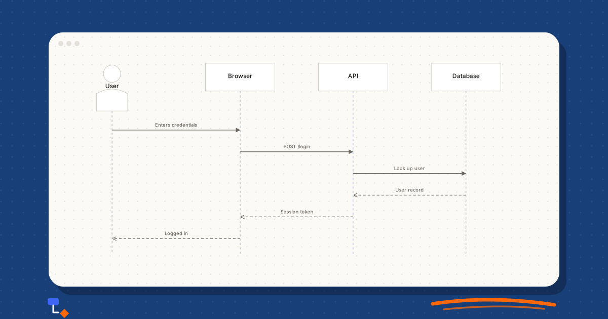
Most bugs that cross a system boundary are ordering bugs. The token was issued before the password was checked. The order was created after the payment, so a dropped connection left money taken and no record of why. Each system did exactly what its code says. The problem lives between them, in the order of the conversation.
A sequence diagram is the tool for looking at that conversation. It puts each participant in a column, time running down the page, and every message as an arrow from one column to another. This article covers the notation (participants, lifelines, messages, returns, activation and notes), works through a login across a website, an API and a database, and explains when a sequence diagram tells you more than a flowchart would.
What a sequence diagram shows
A sequence diagram is one of the interaction diagrams in UML. It describes one scenario: a single path through a conversation between parts of a system, such as a user logging in successfully. It does not describe the structure of those parts (that is a class diagram) or the full logic of any one of them (that is a flowchart or the code).
Two axes carry all the meaning. Horizontally, each participant gets a column. Vertically, time runs downwards: a message drawn lower happened later. There is no scale on the vertical axis. A gap between two arrows does not mean a delay, only that one came after the other.
Because it shows one scenario, a sequence diagram is deliberately narrow. That is its strength. You can draw the happy path of a checkout in six arrows and see at once whether the order is created before or after the payment. Trying to show every branch on one diagram is the most common way to ruin one.
Participants and lifelines
Participants sit in a row across the top. Each one is something that sends or receives messages: a person, a browser, a service, a database, a third-party provider. A person is often drawn as a stick figure (UML calls this an actor) and everything else as a labelled box.
From each participant a dashed vertical line, the lifeline, runs down the page. It represents the participant existing over the time the diagram covers. Messages start and end on lifelines. A participant created partway through the scenario starts its lifeline at the point it is created; one that is destroyed ends with a cross.
Order the participants so most arrows point the same way. The usual convention puts whoever starts the interaction on the left and places each participant to the right of the one that calls it. For a web request that gives user, browser or website, API, then database or external service. When the ordering is right, the request reads left to right and the replies come back right to left.
- Name participants by role, not by technology, unless the technology is the point. "Payment provider" survives a change of provider; a product name does not.
- Include an external system as a participant when its behaviour affects the order of events. A payment provider that can time out belongs on the diagram.
- Leave out participants that only pass messages through unchanged, such as a load balancer, unless they are the subject.
Messages and returns
Each arrow is a message, labelled with what is being asked or sent. The arrow style tells the reader what kind of message it is:
| Message | Drawn as | Means |
|---|---|---|
| Synchronous | Solid line, filled arrowhead | The caller waits for a reply before continuing |
| Asynchronous | Solid line, open arrowhead | The caller sends and carries on without waiting |
| Return | Dashed line, open arrowhead | The reply to an earlier synchronous call |
| Self-message | An arrow that loops back to the same lifeline | A participant calls one of its own operations |
| Create | Dashed arrow to the head of a new participant | A participant brings another into existence |
Label messages with something specific. "Request" and "Response" tell the reader nothing. "POST /login", "Look up user by email" and "User record or not found" tell them what crosses the boundary and what comes back. For APIs, the HTTP method and path are often the clearest label available.
Returns are optional in strict UML when the reply is obvious, and many teams leave them out to reduce clutter. Draw them when the content of the reply matters to the next step, or when the reader needs to see that the caller was blocked waiting. In a login flow, the reply from the database is the thing the next decision depends on, so it earns its arrow.
Activation, notes and fragments
An activation bar is a thin rectangle drawn over a lifeline from the moment a participant receives a call to the moment it returns. It shows when each participant is busy. Nested calls produce nested bars, which makes it easy to see that the API is still holding the browser's request open while it waits on the database.
A note is a small box with a folded corner attached to a lifeline or a message. Use notes for the constraints that make the order matter: "password hash compared in constant time", "hold expires after 10 minutes", "idempotency key sent with retry". These are often the details a reviewer most needs and the ones least likely to be in the code comments.
Combined fragments are boxes drawn around a group of messages, with an operator in the corner. Three cover most needs:
- alt: alternatives. The box is split by a dashed line, each part with a condition in square brackets, such as [password correct] and [password wrong].
- opt: an optional section that runs only if its condition holds, such as [remember me ticked].
- loop: messages repeated while a condition holds, such as [for each line item].
Fragments are powerful and easy to overuse. One alt fragment for the main failure case is usually clear. Three nested fragments mean the diagram is trying to be a flowchart, and it should probably be two diagrams.
Worked example: User, Website, API, Database
A team is adding sign-in to a web application. The architecture is ordinary: a user in a browser, a website front end, an API behind it, and a database holding user records. The product owner's description is one sentence: "the user enters their email and password and gets logged in". Here is how that sentence becomes a sequence diagram, and what drawing it reveals.
Start with the participants in calling order, left to right: User, Website, API, Database. Then add messages from top to bottom, one at a time, asking at each step "who does what next, and what do they need to do it?"
- User to Website: submits email and password on the sign-in form.
- Website to API: POST /login with the credentials. Synchronous; the website waits.
- API to Database: look up the user by email. Synchronous.
- Database to API (return): the user record, including the stored password hash, or nothing.
- API, self-message: compare the submitted password with the stored hash.
- API to Website (return): a session token, set as a cookie.
- Website to User: the signed-in page.
Drawing step five is where the useful conversation happens. The comparison has to come after the database read and before the token is issued; issuing the token any earlier would be a security bug. On the diagram the order is visible and reviewable. In the code it is spread across a controller, a service and a repository.
Notice which messages are synchronous. The website cannot show anything until the API answers, and the API cannot answer until the database does, so a slow query delays the user directly. Drawing activation bars makes that chain visible: three nested bars, all open at once, waiting on the participant furthest to the right. If the lookup ever needs to call another service, that bar gets longer for everyone.
Then ask what the description left out. What happens when the email is not found? The API should return the same error as for a wrong password, so an attacker cannot learn which emails have accounts. That is an alt fragment around steps five and six with two branches, and a note recording the rule. What about repeated failures? That may be a separate diagram, which is fine. One diagram per scenario is the habit to build.
%20scale(0.77)%20translate(0%2C0)%22%3E%3Cline%20x1%3D%2245%22%20y1%3D%2255%22%20x2%3D%22340%22%20y2%3D%2232%22%20stroke%3D%22%236b6660%22%20stroke-width%3D%221.5%22%2F%3E%3Cline%20x1%3D%22340%22%20y1%3D%2232%22%20x2%3D%22600%22%20y2%3D%2232%22%20stroke%3D%22%236b6660%22%20stroke-width%3D%221.5%22%2F%3E%3Cline%20x1%3D%22600%22%20y1%3D%2232%22%20x2%3D%22860%22%20y2%3D%2232%22%20stroke%3D%22%236b6660%22%20stroke-width%3D%221.5%22%2F%3E%3Cline%20x1%3D%22860%22%20y1%3D%2232%22%20x2%3D%22600%22%20y2%3D%2232%22%20stroke%3D%22%236b6660%22%20stroke-width%3D%221.5%22%20stroke-dasharray%3D%226%204%22%2F%3E%3Cline%20x1%3D%22600%22%20y1%3D%2232%22%20x2%3D%22340%22%20y2%3D%2232%22%20stroke%3D%22%236b6660%22%20stroke-width%3D%221.5%22%20stroke-dasharray%3D%226%204%22%2F%3E%3Cline%20x1%3D%22340%22%20y1%3D%2232%22%20x2%3D%2245%22%20y2%3D%2255%22%20stroke%3D%22%236b6660%22%20stroke-width%3D%221.5%22%20stroke-dasharray%3D%226%204%22%2F%3E%3Cg%20transform%3D%22translate(0%2C0)%22%20opacity%3D%221%22%3E%3Cpath%20d%3D%22M25.2%2C24.2%20a19.8%2C19.8%200%201%200%2039.6%2C0%20a19.8%2C19.8%200%201%200%20-39.6%2C0%20Z%20M9%2C110%20L9%2C70.32%20Q45%2C48.95%2081%2C70.32%20L81%2C110%20Z%22%20fill%3D%22%23ffffff%22%20stroke%3D%22%23c8c4bd%22%20stroke-width%3D%221%22%2F%3E%3C%2Fg%3E%3Cg%20transform%3D%22translate(260%2C0)%22%20opacity%3D%221%22%3E%3Crect%20x%3D%220%22%20y%3D%220%22%20width%3D%22160%22%20height%3D%2264%22%20rx%3D%220%22%20fill%3D%22%23ffffff%22%20stroke%3D%22%23c8c4bd%22%20stroke-width%3D%221%22%2F%3E%3C%2Fg%3E%3Cg%20transform%3D%22translate(520%2C0)%22%20opacity%3D%221%22%3E%3Crect%20x%3D%220%22%20y%3D%220%22%20width%3D%22160%22%20height%3D%2264%22%20rx%3D%220%22%20fill%3D%22%23ffffff%22%20stroke%3D%22%23c8c4bd%22%20stroke-width%3D%221%22%2F%3E%3C%2Fg%3E%3Cg%20transform%3D%22translate(780%2C0)%22%20opacity%3D%221%22%3E%3Crect%20x%3D%220%22%20y%3D%220%22%20width%3D%22160%22%20height%3D%2264%22%20rx%3D%220%22%20fill%3D%22%23ffffff%22%20stroke%3D%22%23c8c4bd%22%20stroke-width%3D%221%22%2F%3E%3C%2Fg%3E%3C%2Fg%3E%3C%2Fsvg%3E)
The same approach scales to flows with an external party. In a checkout, the payment provider is outside your control and can fail or time out, so the order of creating and confirming the order around the payment call is the whole design.
%20scale(0.77)%20translate(0%2C0)%22%3E%3Cline%20x1%3D%2245%22%20y1%3D%2255%22%20x2%3D%22340%22%20y2%3D%2232%22%20stroke%3D%22%236b6660%22%20stroke-width%3D%221.5%22%2F%3E%3Cline%20x1%3D%22340%22%20y1%3D%2232%22%20x2%3D%22600%22%20y2%3D%2232%22%20stroke%3D%22%236b6660%22%20stroke-width%3D%221.5%22%2F%3E%3Cline%20x1%3D%22600%22%20y1%3D%2232%22%20x2%3D%22860%22%20y2%3D%2232%22%20stroke%3D%22%236b6660%22%20stroke-width%3D%221.5%22%2F%3E%3Cline%20x1%3D%22860%22%20y1%3D%2232%22%20x2%3D%22600%22%20y2%3D%2232%22%20stroke%3D%22%236b6660%22%20stroke-width%3D%221.5%22%20stroke-dasharray%3D%226%204%22%2F%3E%3Cline%20x1%3D%22600%22%20y1%3D%2232%22%20x2%3D%22340%22%20y2%3D%2232%22%20stroke%3D%22%236b6660%22%20stroke-width%3D%221.5%22%20stroke-dasharray%3D%226%204%22%2F%3E%3Cline%20x1%3D%22340%22%20y1%3D%2232%22%20x2%3D%2245%22%20y2%3D%2255%22%20stroke%3D%22%236b6660%22%20stroke-width%3D%221.5%22%20stroke-dasharray%3D%226%204%22%2F%3E%3Cg%20transform%3D%22translate(0%2C0)%22%20opacity%3D%221%22%3E%3Cpath%20d%3D%22M25.2%2C24.2%20a19.8%2C19.8%200%201%200%2039.6%2C0%20a19.8%2C19.8%200%201%200%20-39.6%2C0%20Z%20M9%2C110%20L9%2C70.32%20Q45%2C48.95%2081%2C70.32%20L81%2C110%20Z%22%20fill%3D%22%23ffffff%22%20stroke%3D%22%23c8c4bd%22%20stroke-width%3D%221%22%2F%3E%3C%2Fg%3E%3Cg%20transform%3D%22translate(260%2C0)%22%20opacity%3D%221%22%3E%3Crect%20x%3D%220%22%20y%3D%220%22%20width%3D%22160%22%20height%3D%2264%22%20rx%3D%220%22%20fill%3D%22%23ffffff%22%20stroke%3D%22%23c8c4bd%22%20stroke-width%3D%221%22%2F%3E%3C%2Fg%3E%3Cg%20transform%3D%22translate(520%2C0)%22%20opacity%3D%221%22%3E%3Crect%20x%3D%220%22%20y%3D%220%22%20width%3D%22160%22%20height%3D%2264%22%20rx%3D%220%22%20fill%3D%22%23ffffff%22%20stroke%3D%22%23c8c4bd%22%20stroke-width%3D%221%22%2F%3E%3C%2Fg%3E%3Cg%20transform%3D%22translate(780%2C0)%22%20opacity%3D%221%22%3E%3Crect%20x%3D%220%22%20y%3D%220%22%20width%3D%22160%22%20height%3D%2264%22%20rx%3D%220%22%20fill%3D%22%23ffffff%22%20stroke%3D%22%23c8c4bd%22%20stroke-width%3D%221%22%2F%3E%3C%2Fg%3E%3C%2Fg%3E%3C%2Fsvg%3E)
When a sequence diagram beats a flowchart
Both diagrams show steps in order, and people often reach for a flowchart out of habit. The deciding question is whether the interesting part is the logic within one actor or the hand-offs between several.
| Situation | Better choice | Why |
|---|---|---|
| Several systems exchange messages | Sequence diagram | Columns make each boundary crossing explicit |
| The order of calls is the risk | Sequence diagram | Vertical position shows order without ambiguity |
| One process with many decisions | Flowchart | Diamonds handle branching far better than fragments |
| Explaining an API integration | Sequence diagram | Requests and replies map directly onto arrows |
| A business process with people and approvals | Flowchart or swimlane | The decisions and responsibilities matter more than the messages |
| Debugging a race or timeout | Sequence diagram | You can draw two interleaved scenarios and compare them |
A practical rule: if your flowchart has boxes labelled "API calls database" and "database returns result", you are drawing a sequence diagram in the wrong notation. Switch. If your sequence diagram has more fragment boxes than messages, switch the other way.
Common mistakes
- Several scenarios on one diagram. Draw the happy path first, then one diagram per important failure.
- Vague labels. Every arrow should say what is sent; every return should say what comes back.
- Participants in a random order, which sends arrows criss-crossing the page. Reorder so the request flows one way.
- Missing the external participant. If a third party can fail, it belongs on the diagram.
- Returns that arrive at the wrong participant. A reply goes back to whoever made the call, not to whoever needs the result next.
- Drawing implementation detail, such as every internal method call inside one service. Show the conversation between participants; leave the internals to the code.
Sequence diagrams in DiagramDock
DiagramDock includes a sequence diagram type with its own palette, and three templates to start from: the login flow and checkout above, and a booking flow with an availability check and a timed hold. You place the participants across the top and draw each message between them; DiagramDock stacks the messages down the page in the order you drew them and draws the lifelines. Selecting a message shows its position, with Earlier and Later buttons to move it and a Call or Reply switch for the line style. Activation bars are not drawn, so for long flows it is still worth sketching the message list first, as in the worked example.
Sequence diagrams can be exported as SVG, PNG or PDF, or as Mermaid sequence syntax if you want to keep a text version alongside the code.
Questions
- What is the difference between a sequence diagram and a flowchart?
- A flowchart shows the steps of one process and the decisions between them. A sequence diagram shows several participants and the messages they exchange in time order. If the question is "who calls whom, and in what order", use a sequence diagram; if it is "what happens next, and under which condition", use a flowchart.
- What does a dashed arrow mean in a sequence diagram?
- A return message: the reply to an earlier call, flowing back to the caller. It is drawn as a dashed line with an open arrowhead and labelled with what comes back.
- What is an activation bar?
- A thin rectangle on a participant's lifeline showing the period during which it is busy handling a call. It starts when the message arrives and ends when the participant returns.
- Can DiagramDock lay out a sequence diagram automatically?
- Partly. You place the participants and draw each message yourself. DiagramDock then draws every message as a horizontal arrow at the height given by its place in the order, and draws a dashed lifeline under each participant. Activation bars and notes on lifelines are not drawn automatically.
Keep reading
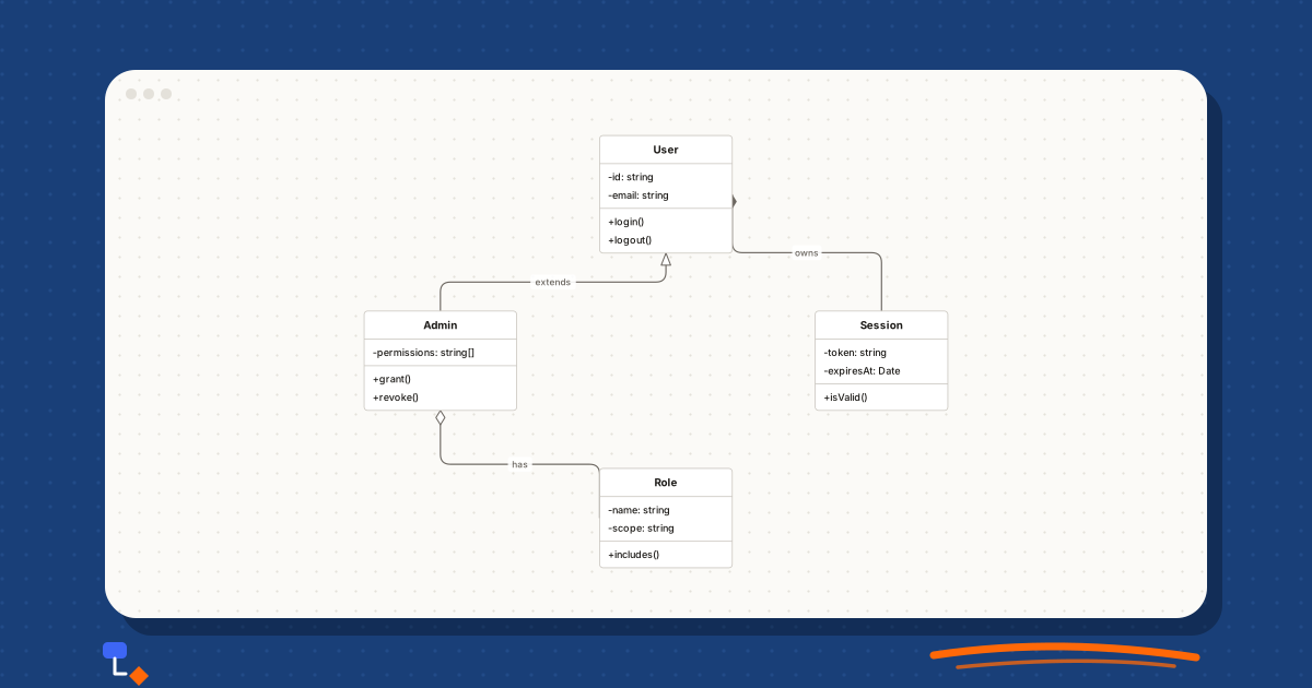
Technical diagrams10 min read
UML class diagrams: a practical introduction
How to read and draw UML class diagrams: compartments, visibility markers, the five relationships and their exact notation, multiplicity and how much detail to show.
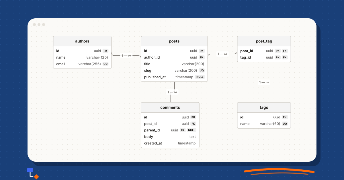
Technical diagrams9 min read
ER diagrams and database tables: understanding the connection
How entity-relationship diagrams map onto real tables: entities and attributes, primary and foreign keys, join tables and cardinality, with SQL alongside.
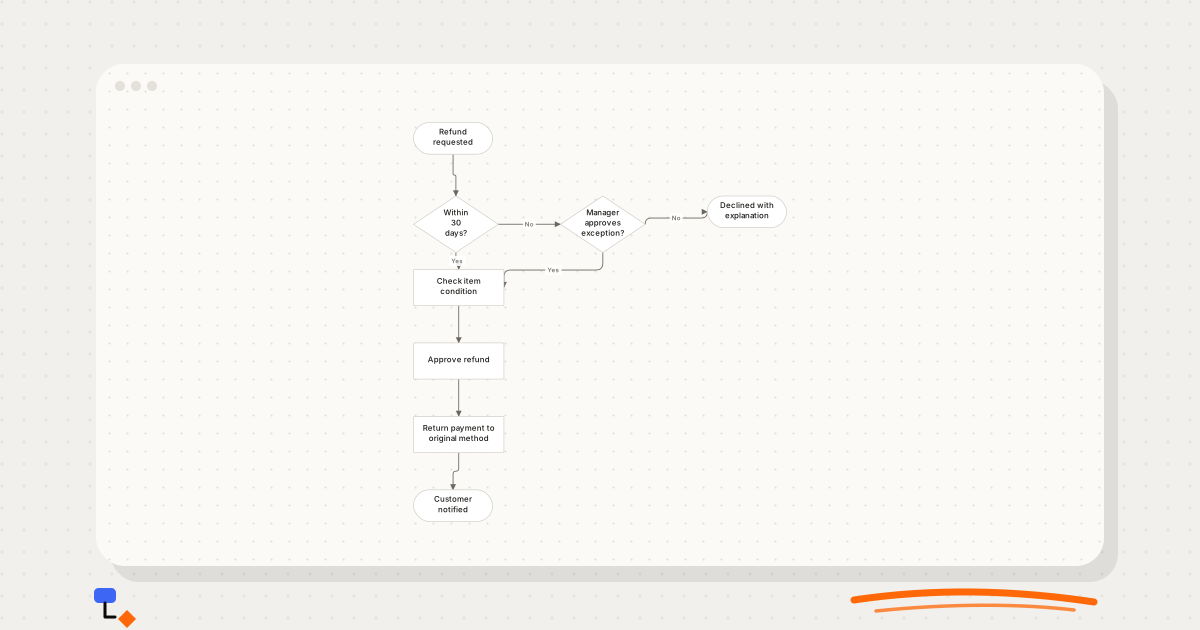
Diagramming9 min read
Decision trees vs flowcharts: which one fits the problem?
Trees branch and never rejoin; flowcharts loop and merge. How that one structural difference decides which diagram to draw, with a refund policy drawn both ways.
Technical diagrams9 min read
Visualising a database before writing the schema
A design-first workflow for databases: nouns to entities, relationships before columns, many-to-many found early, then the diagram turned into CREATE TABLE.